
Some trends that should’ve been left in 2019 and what makes them so terrible

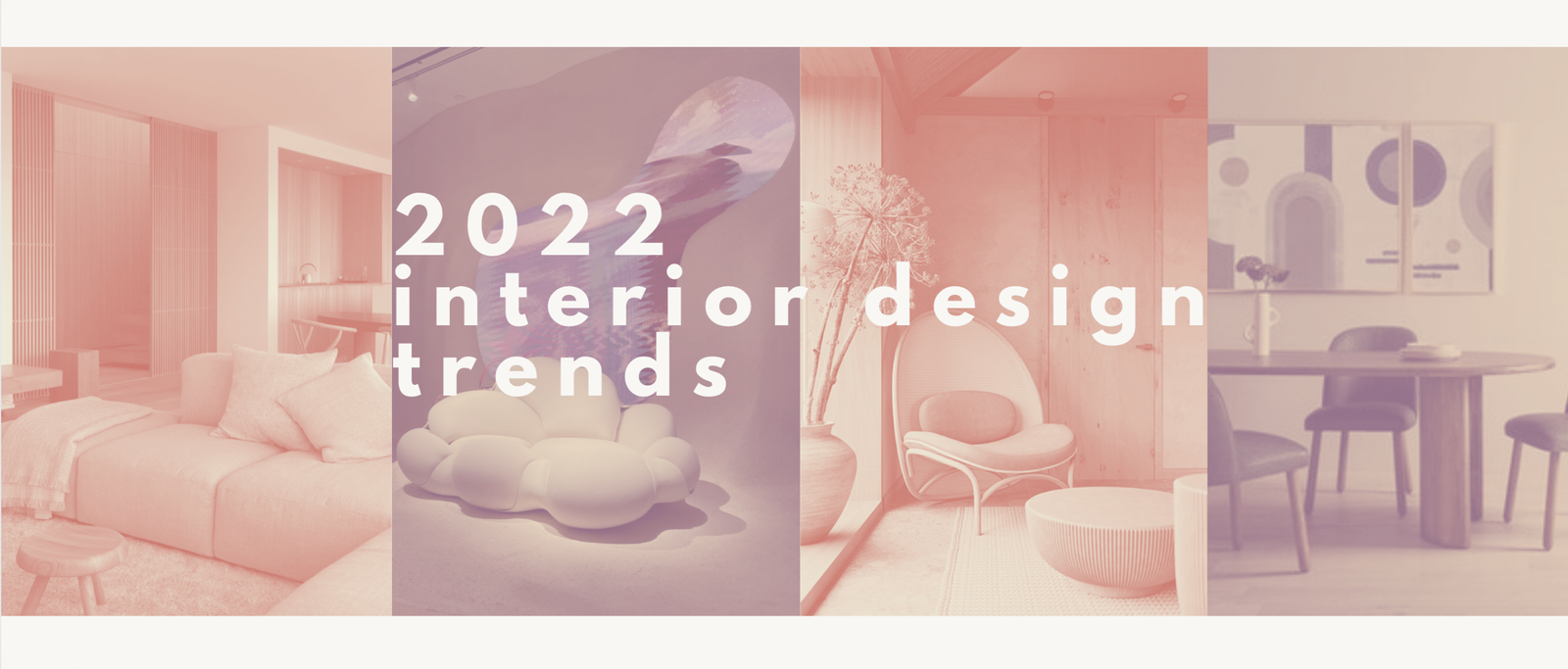
INTERIOR DESIGN TRENDS YOU SHOULD LEAVE
The worst interior design trends (and how to swap them out)
Everyone has those things that irk them to no end. Things that just piss you off immediately when you see them. To me, a lot of these things are design decisions that people make. I don’t understand why the worst interior design trends are often the most popular. There are some random obscure ones, like these ugly ass barn stars that I swear every house in a housing development must automatically come with.

Don’t ask me why, but I could never understand why everyone loved these things so much, and I would get annoyed seeing one taking up the prime real estate on the front of an otherwise perfectly good house.
While that star is probably my most intense dislike, there are tons of current popular trends that I can’t wait to see fade into the distant past (even though some just seem to never want to go away). Whether they seem lazy, basic, or just plain ugly, they gotta go.
Disclaimer: taste is completely subjective and what is ugly as hell to me might be your favorite thing, or vice versa. So if you absolutely love something on this list and it makes you happy, you keep doin’ you. This isn’t me saying anyone who does these things is wrong (I’m just saying that I gag a little when I see it)
Minimalism to the max
I just had to give minimalism the #1 spot on the worst interior design trends list.

Does this or does this not look like an insane asylum?
I touched on it briefly in my post about modern decor, but it deserved a mention in another post. Ultra-minimalistic houses with tons of gray, white, clear glass and TONS of empty space, on top of being creepy, quite frankly feel like a cop-out to me.
Sure sure, they could say they like the simplicity and the cleanliness, but I guarantee that if a lot of these people who “love” minimalism stretched themselves out of their comfort zone a little bit and tried to incorporate some warmer elements or something with life, they’ll surprise themselves with how much they like it.
Minimalism seems like it’s the first thing that people gravitate towards when they start caring about how their home is designed, and it’s probably because it’s easy.
The clean lines and hotel-ness of it makes it seem fancy and expensive, but really, what’s easier than white walls and hardly any furniture?
Don’t get me wrong, I was guilty of this, too when I first started really making my own decisions about my decoration. But I learned more about how to use my creativity and inject some personality, and I grew out of it.
This isn’t to say that it needs to be all maximalist everything. Minimalism can still be great. But be careful that it’s not over the top to the point where you are squeezing out every bit of life from your poor rooms.
A single accent color

Ugh. I feel like I’m totally calling my (very recent) past self out so much with this one.
I used to be terrified of color for some reason and stuck to variations of white, black, brown, and grey. And when I really wanted to go crazy, I threw in a touch of blush pink, baby blue, or teal. A throw pillow here, a picture there. But would never dream of doing all three at the same time.
When I see a room with a single accent color, it feels very safe and formulaic to me. When you only allow a single color to interrupt your neutrals, it always feels like you’re probably sacrificing something just so you don’t mess up your color scheme.
Now I’m gonna give you a reality check: everything that you love is not [insert accent color here]. You probably just restricted yourself to things of that color. Or worse, rejected so many things that were not that color, for the sake of your master plan.
The world will not end if you mix in other colors into the room. In fact, it opens up the possibilities for a ton more creativity in your space.
Now there’s nothing wrong with a color scheme. In my place, for example, there’s a lot of orange, teal, and yellow. First of all, it’s not a single color. But I also have forced myself to be open to allowing lil sprinkles of other colors outside of these three to exist in spaces around my house. And it gives it so much more character.
Tapestries

I didn’t think this needed to be said, but people will NOT. LET. GO. of this fucking trend.
When I see these dingey ass pieces of fabric hung up (usually sloppily) on someone’s wall, I can tell with near certainty that they’ve had it since they got their very first college apartment.
Even if you are in college, do you really want your apartment to look like that college apartment? Always with the mandala pattern and the christmas lights hung over them.
First of all, I don’t even want to know the amount of dust and bacteria clinging to that shit. But like it doesn’t even look good??
Instead of a tapestry, opt for some textural, oversized artwork. Or you can go with one of my personal favorites: hanging a floor-to-ceiling curtain across the whole length of the wall. This is like the sophisticated take on a tapestry.
Modern farmhouse style

Let me preface this by saying that I love Chip + Jo and have binged hours and hours of both Fixer Upper and Behind the Design. I love seeing the transformations that they do, and they are the cutest. But they have created a monster.
Shiplap or “vintage” signs that say something like “kitchen” or “eat” on them. Subway tile or mason jars. Cream and black colored everything. All good things on their own (welllll, I have a few things to say about the signs). But why has everyone collectively lost their damn minds over these things and decided that modern farmhouse is the only way of life?
How many peoples’ houses look like they just filled their whole cart with pieces from here and clicked order?
It’s not exactly my taste, but I do like some aspects of it. And I can respect modern farmhouse as a style.
But now, it’s like a song that I used to casually listen to that’s been overplayed to absolute death on the radio to the point where I regret ever knowing it.
Maybe that’s a little extreme.
But really, can everyone chill out a little bit with it?
(Dis) honorable mentions of the worst interior design trends
- Glittery “abstract” art — not much to be said here. It just looks like you’re copying and pasting from a 2013 Pinterest board.
- Marble contact paper — Just stop. We can tell it’s not marble. There are so many other contact paper designs you can use.
- Extreme symmetry — I understand why people get caught up on symmetry, because it’s what your mind naturally gravitates towards. But allowing yourself to play around with asymmetry can lead to some really cool shit.
Alright alright, rant over.
Hope I didn’t offend anyone. But maybe you guys agree with me.
Let me know your thoughts on the worst interior design trends in the comments below, and
keep it homey homies
About me
Hey my name’s Hannah Michelle Lambert, the voice behind homey homies. I’m an LA-based designer, writer, and content strategist. I’m passionate about the intersection of productivity and creativity. I love talking about creative habits, technology, processes, and everything in between that helps me blend the Type A and Type B parts of my brain.


Thanks for sharing such a fastidious idea, post is fastidious, thats why i have read it completely
Greetings from California! I’m bored to death
at work so I decided to browse your website on my iphone during
lunch break. I love the knowledge you present here and can’t wait to take a look when I get home.
I’m amazed at how fast your blog loaded on my cell phone ..
I’m not even using WIFI, just 3G .. Anyhow, wonderful blog!
Hey there! Someone in my Myspace group shared this site with us so I came to check it out. I’m definitely enjoying the information. I’m bookmarking and will be tweeting this to my followers! Outstanding blog and brilliant design and style.|
whoah this blog is wonderful i love reading your posts. Keep up the good work! You realize, lots of people are hunting around for this info, you can help them greatly. |