
Tips on how to create an impactful gallery wall that stands out from the rest

Best Tips For a Unique Gallery Wall
Everyone loves a good gallery wall, but once you start putting it together and something about it just ain’t lookin right, it’s clear that it’s not as simple as just throwing some pictures up on a wall and calling it good.
To create a gallery wall that is memorable and unique, it takes some planning, creativity, and a little finesse. A lot of it is just making it reflect you in the best way possible — as with most things — but there are a few tips you can follow to help bring your vision to life.
biggest comes first
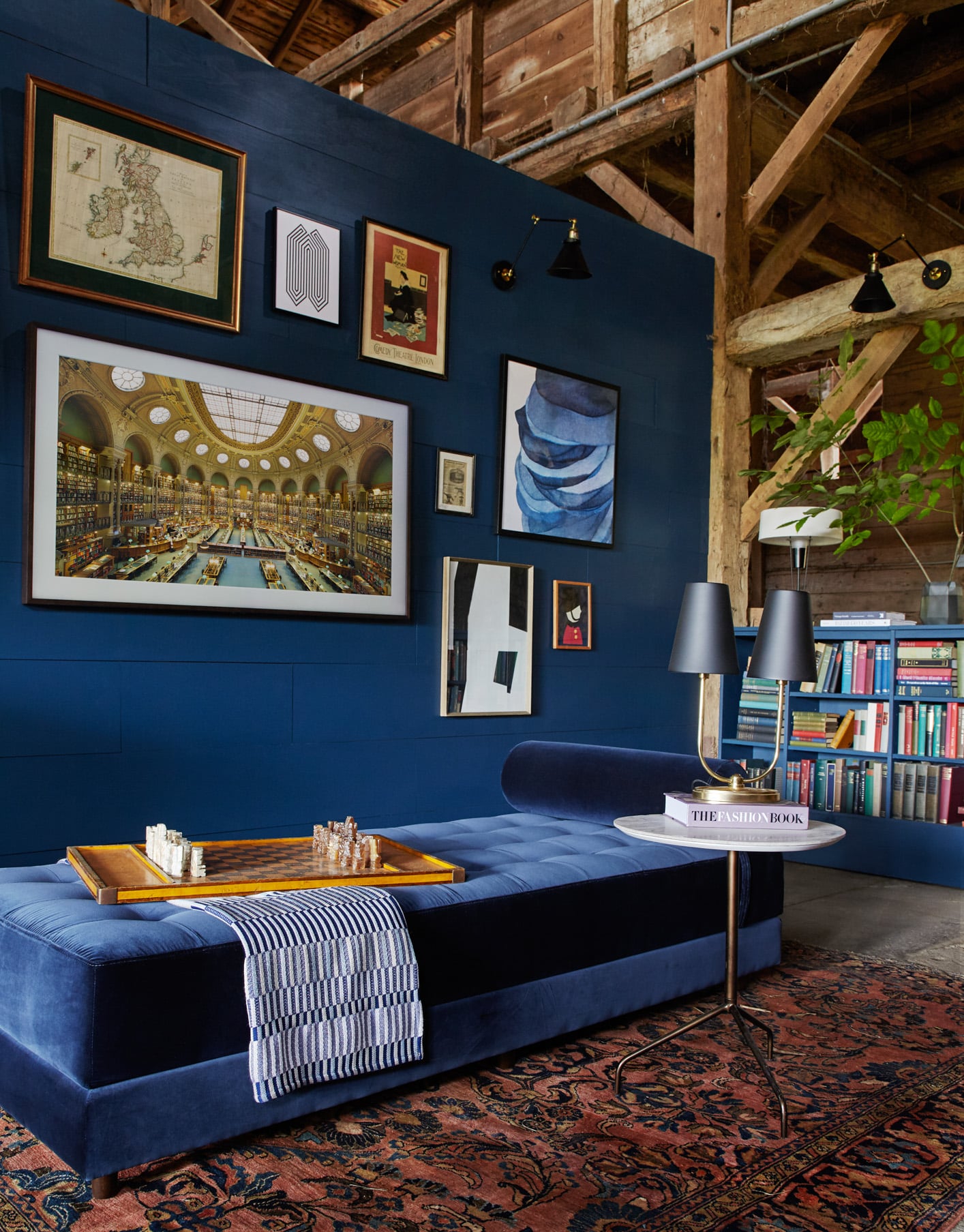
If you hang a ton of little pieces first and then try to shove this big ass painting in the middle of it, chances are it’s not gonna work. Just like you probably wouldn’t place all your little decorations before you choose staple pieces like couches and desks, it’s helpful to see the big piece there first to build around it.
not too matchy-matchy

My rule of thumb is that you just pick a couple of elements that you want to be repeated throughout the gallery wall.
This could be anything from a color scheme in the photos, frame color, frame style, a textural similarity, similar themes in the photos, and so on and so on.
Point being, there are tons of different options to decide on, but make sure to not choose too many themes to follow. A wall with all black and white nature photos all in black skinny frames that are a similar size is just boring and looks pretty cookie cutter. Go ahead and do all black skinny frames, but vary the kinds of photos that fill them.
The wall above has a semi-consistent color scheme — blue, black and white — but they don’t strictly adhere to that scheme and added further differentiation by varying the size, style, and material of the frames.
asymmetry is good
Remember how I mentioned last week that one of my design pet peeves is too much symmetry? Same goes for a gallery wall.

It can be tempting to balance out the wall by starting with one central piece then mirroring similar size objects on either side because it’s so easy. But try to resist that, I promise it’s going to look so much better.
Tip: instead of hammering a million nail holes into your wall while you’re figuring out what arrangement looks best, map out your pieces with tape before you hang them. Asymmetry can be difficult to execute in a way that still looks cohesive, so the ease of placing and removing tape can make the process of finessing an arrangement much smoother.
Another tip: If you are super resistant to letting go of your hangup on symmetry, a really asymmetrical arrangement of frames can be balanced out by a symmetrical spread of colors or other visual cues.
mix the 2D with the 3D

No one is forcing you to stick with only 2D prints in frames. Feel free to change it up a little and add some dimension. This can look a couple of different ways. You could add some things that are flatter than frames by hanging prints/pictures freely with a clip, or you can bulk it up a bit by adding 3D objects like clocks, sculptures, sconces, etc. The possibilities are endless with the wall art that you can buy or make.
These textural differences will add some excitement and demand a little more attention than a totally flush wall, even if every item on the wall is completely monochromatic (low key I kinda want to do a 3D monochromatic orange gallery wall soon)

use shelving
There’s something so casually cool about artwork leaning on walls versus being hung. I’ve always loved seeing these huge pieces of art sitting on the floor, leaning on the walls. But you can even do it on a smaller scale.
You could do something fancy like this or this. Or you can keep it real simple and do a basic Ikea shelf and make it cool with the things you put on it.
Once you hang your shelves, layer your pieces on there, allowing some of them to overlap. The cool thing about shelves is that you can layer in more 3D objects like plants, lil trinkets, etc. to make it a little more unique.

paint it
Now I may be a little biased because I like to paint absolutely everything. But there’s a reason I love it so much. It’s a shit ton of effect for so little money. If you really want to make your wall stand out from the other basic ass Pinterest gallery walls, slapping some paint in a color that makes you happy to see behind it will definitely help you get there.
Some ideas you can do with paint:
- cover the whole wall
- paint a border around your whole collection
- draw a shape that encompasses each of your individual pieces (think a rectangular frame placed within a large rectangle on the wall)
- frame each individual piece within a shape
- freehand some designs straight on the wall between pieces
- whatever the fuck you feel like doing

Gallery walls can be so fun to create if you have some direction before you’re starting. Hopefully this can provide that direction you’re looking for to get started.
happy hangin,
and keep it homey, homies
About me
Hey my name’s Hannah Michelle Lambert, the voice behind homey homies. I’m an LA-based designer, writer, and content strategist. I’m passionate about the intersection of productivity and creativity. I love talking about creative habits, technology, processes, and everything in between that helps me blend the Type A and Type B parts of my brain.
You may also like…
- A guide to all the interior design styles
- Interior design as a side hustle
- Trend alert: colorful minimalism
- 6 months after interior design institute review


Leave a Comment