
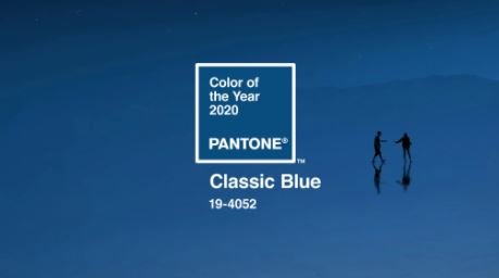
Classic Blue is Pantone’s 2020 color of the year. Here’s my take on what’s so great about it, what it does, where to use it, and how to use it.

Pantone classic blue is the color of the year: why it’s in
As I’m preparing to move to a new apartment, I’m inevitably scheming on what I want to do with the design in my new place. I don’t think a full re-design is in the budget, but I want to make some little changes. So in my ponderings, looking through pinterest, AD issues, and instagram, I remembered the Pantone color of the year, ‘Classic Blue.’ This color looks like a warm velvet blanket rug to me. And I’m gonna run with it in my new home.
It’s somehow both bold and muted at the same time. It’s kinda retro looking, but also could be pretty modern. Either way, it inspired me with some ideas of how to revamp my style a lil in my next place (stay tuned for the millions of posts of that process btw). And luckily for you, gave me some inspiration for this week’s post.
I know I’m a little late but we’re still at the start of 2020.
I’m gonna share a little bit of what’s so great about it, what it can do, and at the end show you a good ass color palette to go along with it.
the psychology of blue

Blue is a common favorite color — it’s teetered between my second and first place my whole life– and it’s because it evokes such a different range of emotions.
At times, blue can mean sad and somber. There’s a reason that people say “feeling blue.” In art, it’s much more common to see a blue painting communicating something depressing than you are to see any other color (well, gray might be tied). In the same negative vein, it can also seem cold and aloof, probably because of its resemblance to ice and the fact that it’s a cool color.
On the flip side, though, there are just as many, if not more, positive associations with the color, too.
Blue also signals trust, security, and reliability. That’s why so many banks (i.e. Chase, Bank of America, Capital One, etc. ) use blue as one of their colors. When we see blue, it puts us at ease for some reason. It’s a non-threatening, familiar color that just makes sense to us.
Serenity and calmness is also a major vibe that you get from blue. Lots of spas, for example, love to use cool colors like blue and green to chill people out. It’s probably because there is a lot of blue in nature — the sky, the color that water appears, birds and insects.
Then there are all of the social associations that we make with blue — the “boy-ish” color that makes people think everything has to be blue at their baby shower just because they are having a boy, the countless sports teams, social media apps, etc.
With all this together, it’s pretty clear to see that blue is pretty engrained in the world we live in, both physically and mentally.
why pantone classic blue?

There are probably 18974015947 shades of blue out there, anywhere from damn near green to a deep, dark navy. So what’s so special about Classic Blue?
I’m not on Pantone’s color selection board, so I can’t speak for them. But they can speak for themselves:
A timeless and enduring blue hue, PANTONE 19-4052 Classic Blue is elegant in its simplicity. Suggestive of the sky at dusk, the reassuring qualities of the thought-provoking PANTONE 19-4052 Classic Blue highlight our desire for a dependable and stable foundation on which to build as we cross the threshold into a new era.
To me, it’s a good compromise between the boring/blah and the colors that are so out there that you’re pretty much tired of them on your walls as soon as the paint dries. It has a sense of boldness and drama because of its saturation, but it’s depth gives it a bit of mutedness that demands attention but isn’t necessarily distracting.
Another unsophisticated and probably unsupported take on what’s so great about this color: if you paint a room this color, it makes you look rich as fuck. It just seems so luxurious and deep. You can’t tell me you walk into a room with this color on the wall, a nice velvet couch, and some brass accents and not just melt.
how to use it
When I saw this color, I immediately knew it was the perfect color to use for one large statement piece. This could be the wall color — probably the biggest statement you could make — or a headboard, arm chair, couch, large piece of art, glassware on a bar cart, rug, a door. Too much of it in a certain room may make it feel a little bit claustrophic. But a single large touch seems like the perfect amount of impact.

As we learned in our mini color psychology lesson earlier, blue is one of the best colors that you can incorporate to encourage relaxing. So it stands to reason that you bring this into spaces you want to chill out in the most. The bedroom and living room, of course. It can help trick your brain into chill mode when you’re sleeping or relaxing on the couch.
Tip: I would avoid putting too much of this color in dining rooms or kitchens, because blue is not a the best color for your appetitie.
In my home, it will most likely be manifested in a big, comfy rug for my living room. And maybe a diy velvet bed frame that I wanted to make for a while.

my suggested color palette
As promised, I included what I think a dope color palette would be to work Classic Blue into. The color combo was in part inspired by the current color palette in my house. But mostly I ran with the vintage vibe of classic blue. This palette reminds me of a cozy, stylish home in the seventies. The glamor of tall ceilings and grand furniture and the comfort of warm and inviting textiles like velvet and wool.
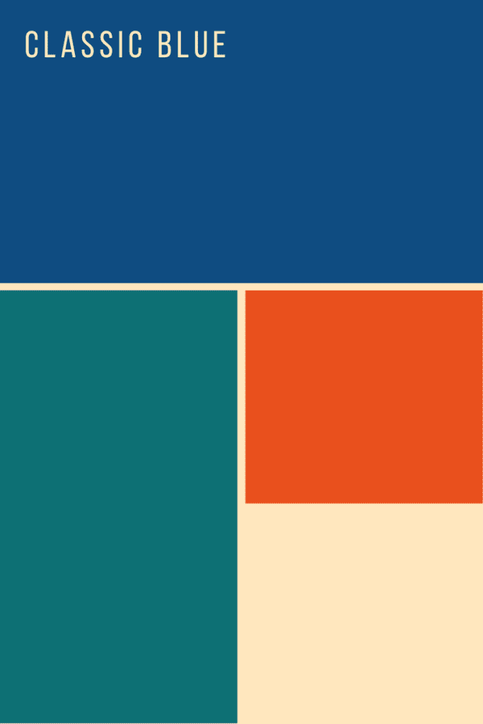
Does this palette give you The Jetsons vibes? Like how people in the 60’s imagined the future being?

Maybe it’s just me.
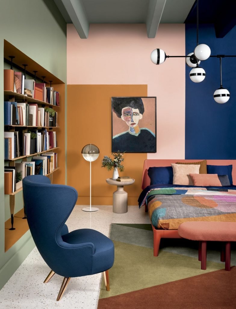
But anyways, I’m also obsessed with the palette that’s in the photo below which gives me a similarly retro feel
Let me know below how you plan to involve this complex color into your own home! And I’ll keep you all updated with how I end up using it in mine!
keep it homey, homies
About me
Hey my name’s Hannah Michelle Lambert, the voice behind homey homies. I’m an LA-based designer, writer, and content strategist. I’m passionate about the intersection of productivity and creativity. I love talking about creative habits, technology, processes, and everything in between that helps me blend the Type A and Type B parts of my brain.


Leave a Comment