
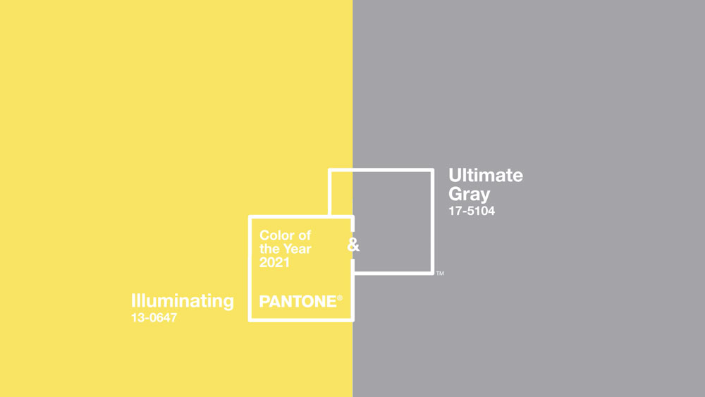
Pantone announced their color of the year for 2021 and turns out it’s actually 2 colors. This is only the second time in 22 years that they’ve opted for more than one color. What better year to switch things up than the shitshow that was 2020, right? The two colors they chose this year are PANTONE 17-5104 Ultimate Gray and PANTONE 13-0647 Illuminating.
I don’t wanna say I think they copied the color scheme from my logo, but…
I’ll let you have this one for free, Pantone. But next time I’ll be sending over an invoice.
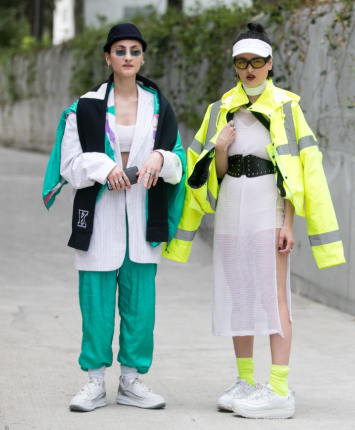
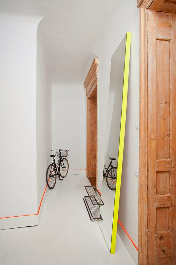
This has always been one of my favorite color combinations, at least for clothing. It’s super sporty and kinda futuristic, kinda Y2K looking. I can totally picture Xenon wearing an outfit with these colors.
but there’s more to this 2021 Panton color of the year combo than just looking dope
The contrast between the two colors this year is striking and very intentional. There’s the classic, comfortable, sturdy feel to the gray. Then there’s the playful, optimistic, and lively feel to the yellow. According to Pantone, this juxtaposition was very intentional. They chose “two independent colors that highlight how different elements come together to support one another.”
This is an especially strong message this year where both comfort and fun are important yet difficult to establish. I think one thing we’ve all realized this year is that balance is what it’s all about. Some of us went into productivity overdrive, while others of us chilled all the way out and indulged in whatever tf we wanted to do. This may be a little bit of a reach, but it seems like this color combination is a pretty good representation of the value of both the fun and the practical things in life.

Another quote from Pantone about their selection was especially strong to me: “positivity supported by fortitude… practical and rock solid but at the same time warming and optimistic.”
that’s the emotional and philosophical side, now let’s get to the practical
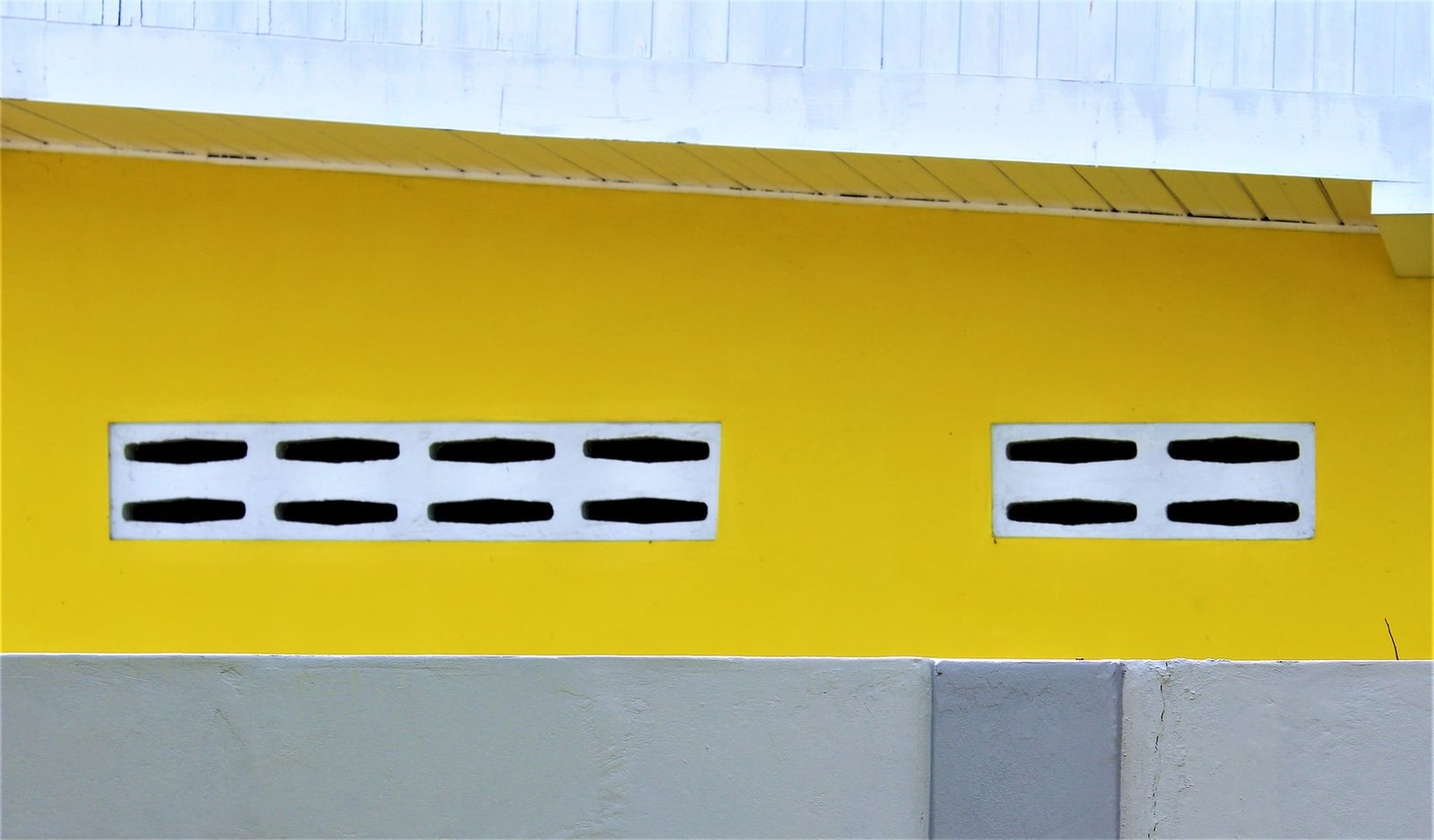
I see this color combination being extremely well-suited for commercial purposes or for exteriors. And it will probably be a major trend for years to come. A mostly gray, concrete exterior with a pop of yellow is *chefs kiss*


I could see this being perfect for an office setting, too. The yellow to energize the space and the gray to provide some peace and comfort. It could also be used in the overall branding for a company. Not only is it a visually striking contrast of colors, but the emotional associations with the colors can also be a huge asset to how customers, users, etc. experience your brand. Again, not gonna brag but, ya know.
what about residential interiors?
It’s a bit of a strong color combination for main pieces in a residential home. I would be hesitant to paint a whole room with these colors, unless it’s maybe a home office. But small touches here and there that can be easily switched out would be a great idea.
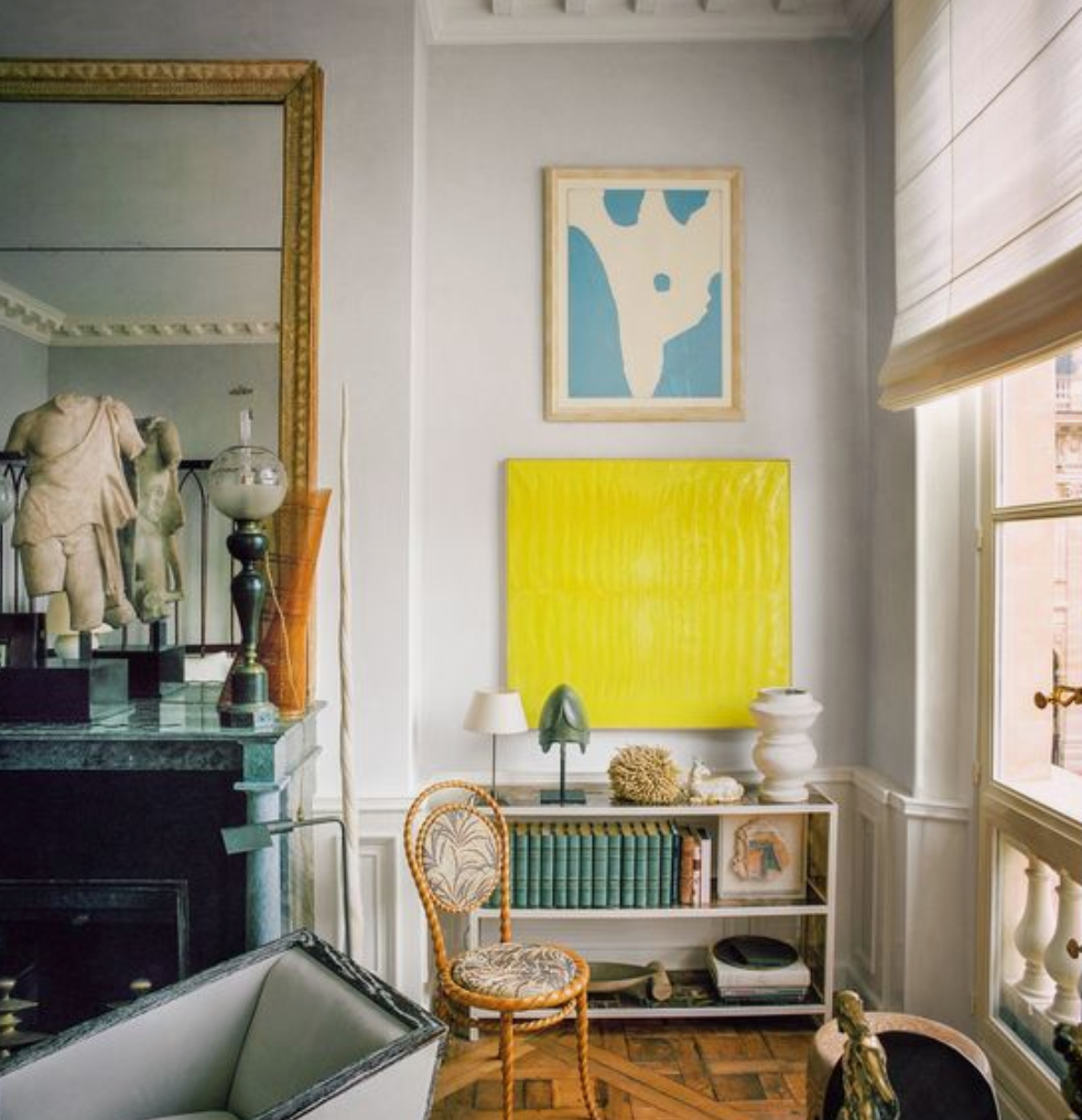
The easiest way to work any trendy color into your home: wall art. This is a great way to test out your DIY skills, too. Sometimes I’m hesitant to break the bank on something super trendy, so making it yourself can be fun and more cost-effective. Maybe try doing my DIY popsicle art and painting it these colors?
You can also go a little bolder and get throw pillows or even side chairs. Overall, though, I see this trend being used mainly as accent colors in residential interiors.
So what do you think of the Pantone 2021 Colors of the Year? Let me know in the comments below how you’re looking forward to incorporating these colors into your life!
keep it homey, homies
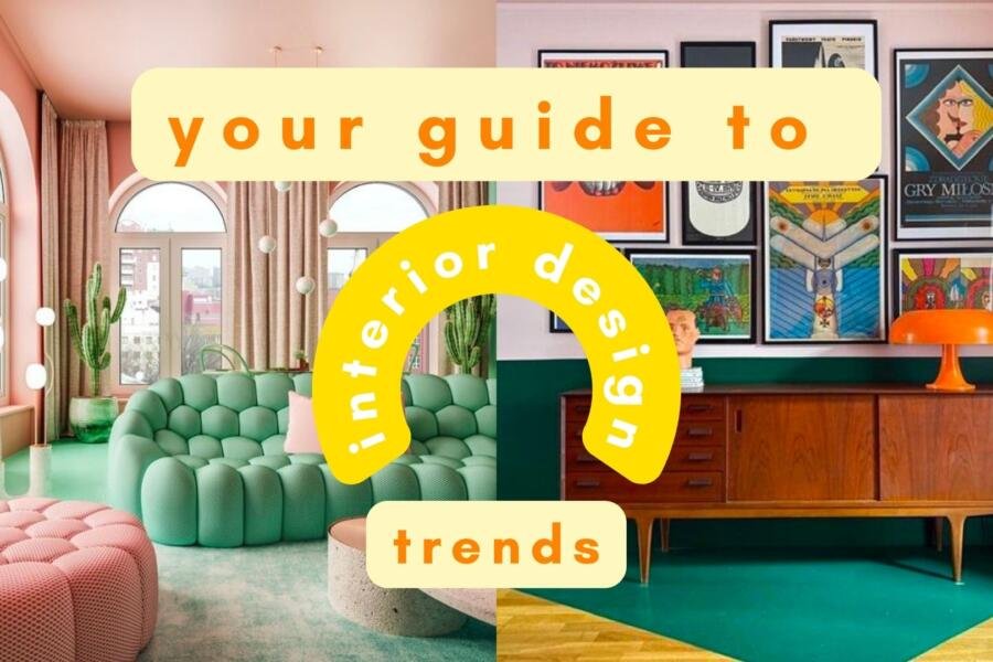
Your Complete Guide to Interior Design Trends
Want to know more about where interior design trends come from, who decides them, why some stick while others don’t, and how to apply them while maintaining your own personal style? Check out my complete guide blog post.
About me
Hey my name’s Hannah Michelle Lambert, the voice behind homey homies. I’m an LA-based designer, writer, and content strategist. I’m passionate about the intersection of productivity and creativity. I love talking about creative habits, technology, processes, and everything in between that helps me blend the Type A and Type B parts of my brain.


Leave a Comment