Interior design is an extremely subjective art form. Whether it looks “good” or not is often up to the taste of people who observe it. There’s no certain formula for beautiful or terrible design. Some of the best design can break tons of rules, and some rooms technically follow all the rules but just feel wrong. However, that being said, there are some general rules you can combine with your natural intuition, or your “eye,” to guide you towards the beautiful end of the spectrum. To make this simple, I’m going to give you the 3 most common interior design mistakes to avoid.
Use your gut first and foremost, but these tips should help you avoid, or correct, some mistakes that are holding your home back from its full potential.
wrong scale for the room
This is one of the easiest ways for a room full of beautiful pieces to just feel off.
If you have a small room, you may be tempted to fill it with larger furniture to give it a false sense of grandiosity. But this is actually counterintuitive. The scale of the furniture will just make the small room look even smaller in comparison. Instead, opt for smaller, more delicate pieces that don’t take up as much visual space.
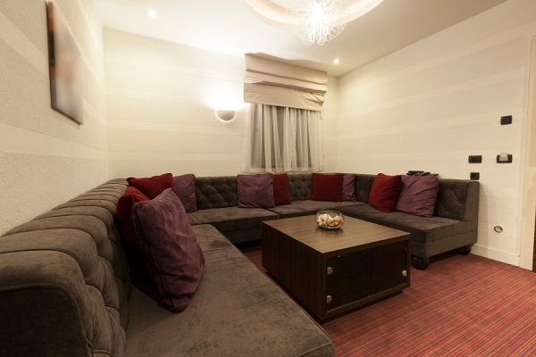


Problems with scale apply to larger rooms as well. If you fill a massive room with a ton of small furniture, it makes the furniture look even smaller than it is, and it doesn’t take full advantage of the opportunities in the large room.
If you have super high ceilings, go for large artwork and furniture. Feel free to fill it with a massive, plush couch. You’ll immediately notice the harmony when the scale of the room and the things that fill it match.

over-curating
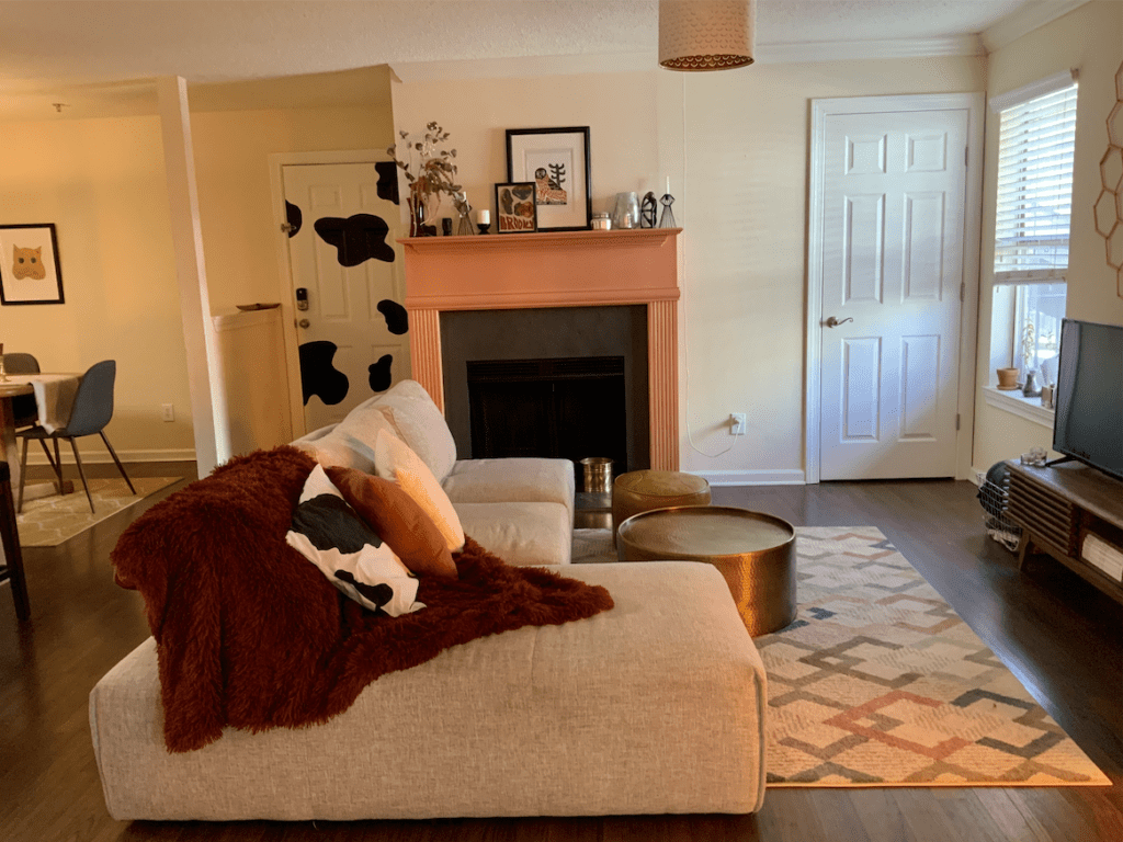

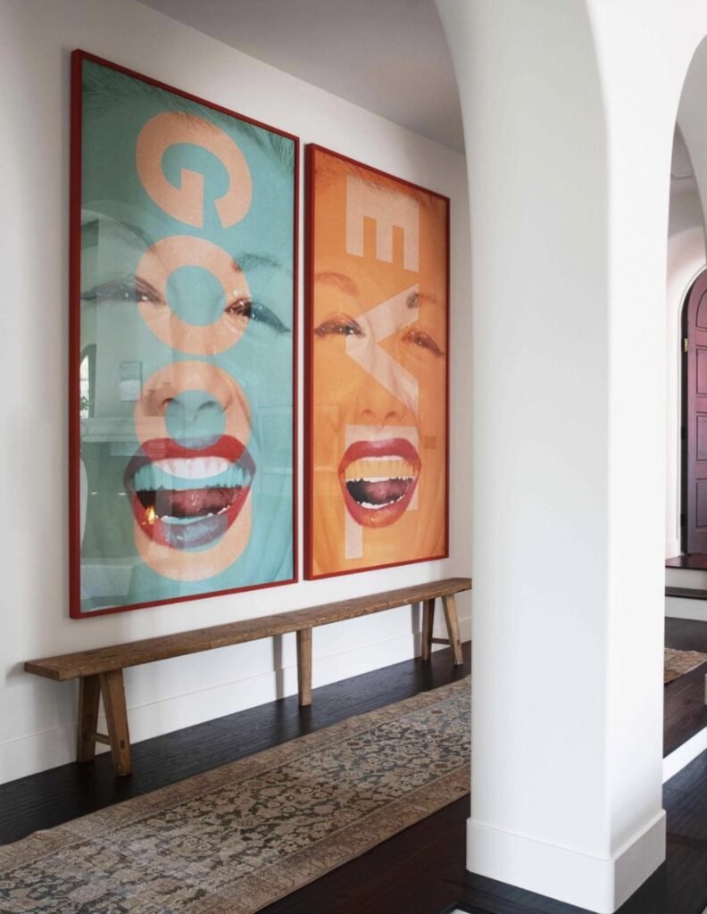
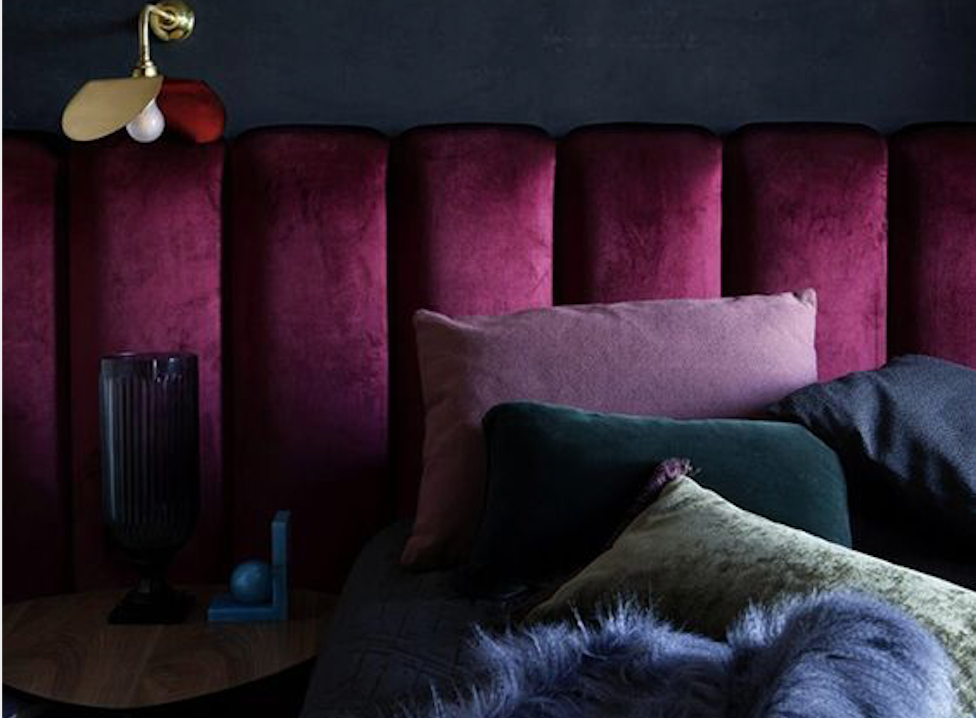
It’s no secret that I’m a fan of maximalism. I may take it to a little more of an extreme than most people, and this level of maximalism may not fit everyone’s taste. But I think that one of the biggest ways to kill the vibe in your home to is over-curate it.
This doesn’t mean that minimalism is innately bad. Some people are psychologically drawn to simpler, more bare spaces. A cluttered space can lead to a cluttered mind for a lot of people. But there are ways to still keep your home on the minimalist end of the spectrum without making it feel like a museum.


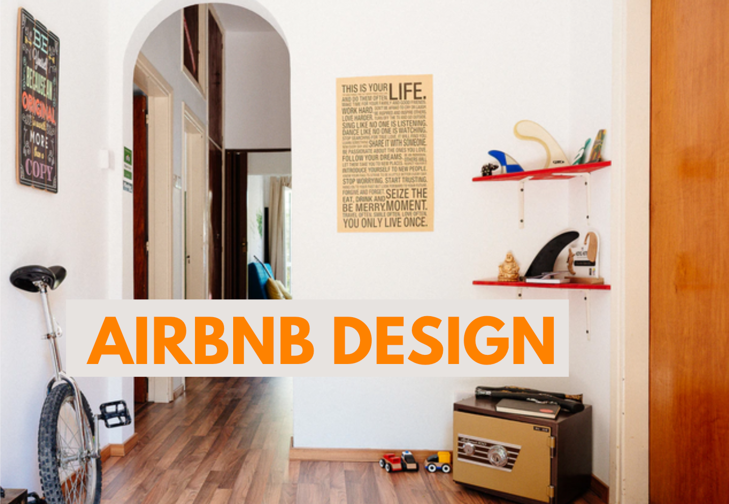
An example of an overly curated home is one that allows no straying from the intended scheme. Everything in minimalist and uniform. Although this may be beautiful in an Instagram picture, it doesn’t feel good to live in. Allowing some personal details to seep into you home, even if they stick out a little, will ultimately make your home unique, comfier, and more custom to you.


making it difficult to switch things up
If you’re anything like me, you have a constant urge to completely change the decoration style in your home. It’s bound to happen when you’re always keeping tabs on new trends and products. So one of the biggest interior design mistakes you can make — especially when you’re on a budget — is to make it really hard to change elements in your design scheme.
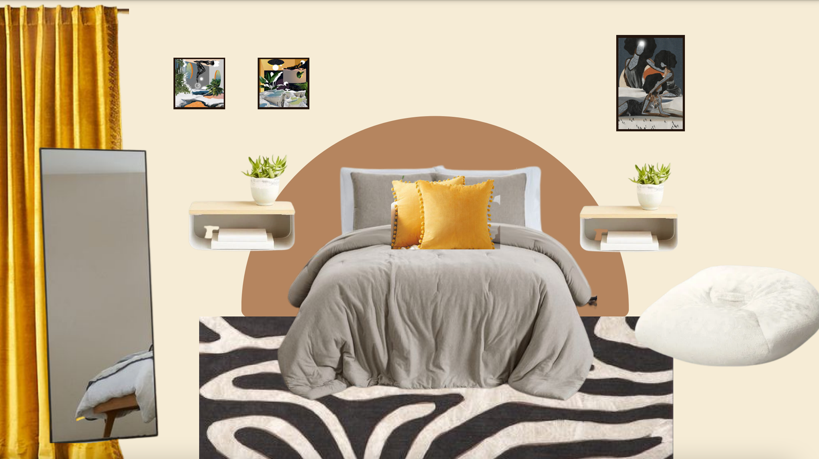
The ways that you can set yourself up for some problems is by purchasing large, expensive statement pieces. For example, let’s say I’m really into cheetah print all of a sudden, and I decide to buy a huge, pricey cheetah print couch, or replace the flooring with cheetah print carpet in my living room. A pattern as bold as this is going to be extremely difficult to work around when you (inevitably) decide that you want to change things up.
This doesn’t mean don’t make statements. That would go against my whole philosophy on design. I love taking risks when it comes to decoration, you just gotta do it the right way. There are tons of ways that you can make statements without locking yourself into it forever, like:
- getting a statement area rug or chair that can be swapped – less permanent installments are the best places to experiment
- painting a feature wall that can easily be painted over (though this is slightly more high effort)
- try out a really trendy thing in an area like your office or guest bathroom where you can take more risks
- get large items thrifted, so you won’t be throwing away a ton of money when you want to replace it


Now if you love cheetah print, have loved cheetah print all your life and will continue to want to be surrounded by cheetah print every day for the next several years – by all means, go for it. But if you’re considering trying out a really cool new trend, it’s definitely best to sit with it a little bit. Try out cheaper, less permanent ways of introducing it into your home.
take my take top interior design mistakes with a grain of salt
Like I said, design is subjective. So use your intuition to decide where you want to go with your project. These are merely a guide for what you may need to take caution with. But if you’re creating for a client, these are pretty important to avoid.
Good luck with your design project, and
keep it homey, homies
Looking to start redecorating a room but don’t quite know where to start? Check out my room decoration worksheet to get your step-by-step guide on everything to consider, plan, and execute along the way.
About me
Hey my name’s Hannah Michelle Lambert, the voice behind homey homies. I’m an LA-based designer, writer, and content strategist. I’m passionate about the intersection of productivity and creativity. I love talking about creative habits, technology, processes, and everything in between that helps me blend the Type A and Type B parts of my brain.



Leave a Comment