

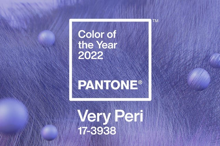
It’s our favorite time of the year: Pantone unveiled their 2022 color of the year! This year it’s a calming yet bright purple called “Very Peri.” If you were to pick a color to represent this moment in time – and generation coming of age right now – this would be it.
Pantone describes this color as a “dynamic periwinkle blue hue with a vivifying violet red undertone.”
This Pantone 2022 color of the year fits in really well with some of the biggest trends this year.
Overall, especially in the younger generations, self love and relaxation have been huge. And this manifests itself in design. People are looking for ways to introduce calm into their homes, and color is one of the best ways to make this happen.
This color has a soothing blue tone, but the subtle red undertones also give it a pinch of energy. This lines right up with a generation that’s grappling to balance their mental health with their bigger-than life aspirations and the hustle that it takes to achieve that.
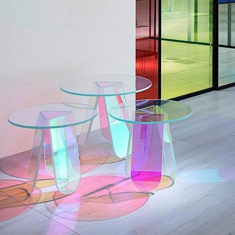
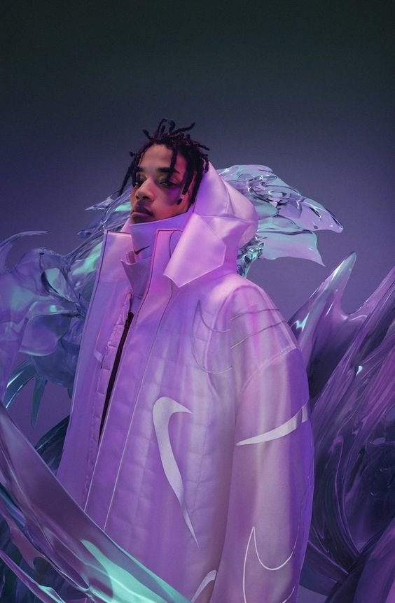
Another trend this year was iridescence. The underlying purple/blue color scheme is what really drove this futuristic yet dreamy trend. Think Zenon meets wabi sabi. That’s the style I think we’re moving towards in 2022. So, Very Peri seems like a logical choice.

Overall, Pantone’s choice seems to support a very forward-looking optimism, creativity, and intentional energy that Gen Z has had this past year.
how will Very Peri look in interior design this year?
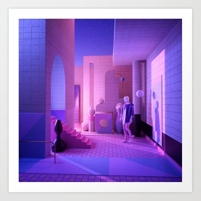
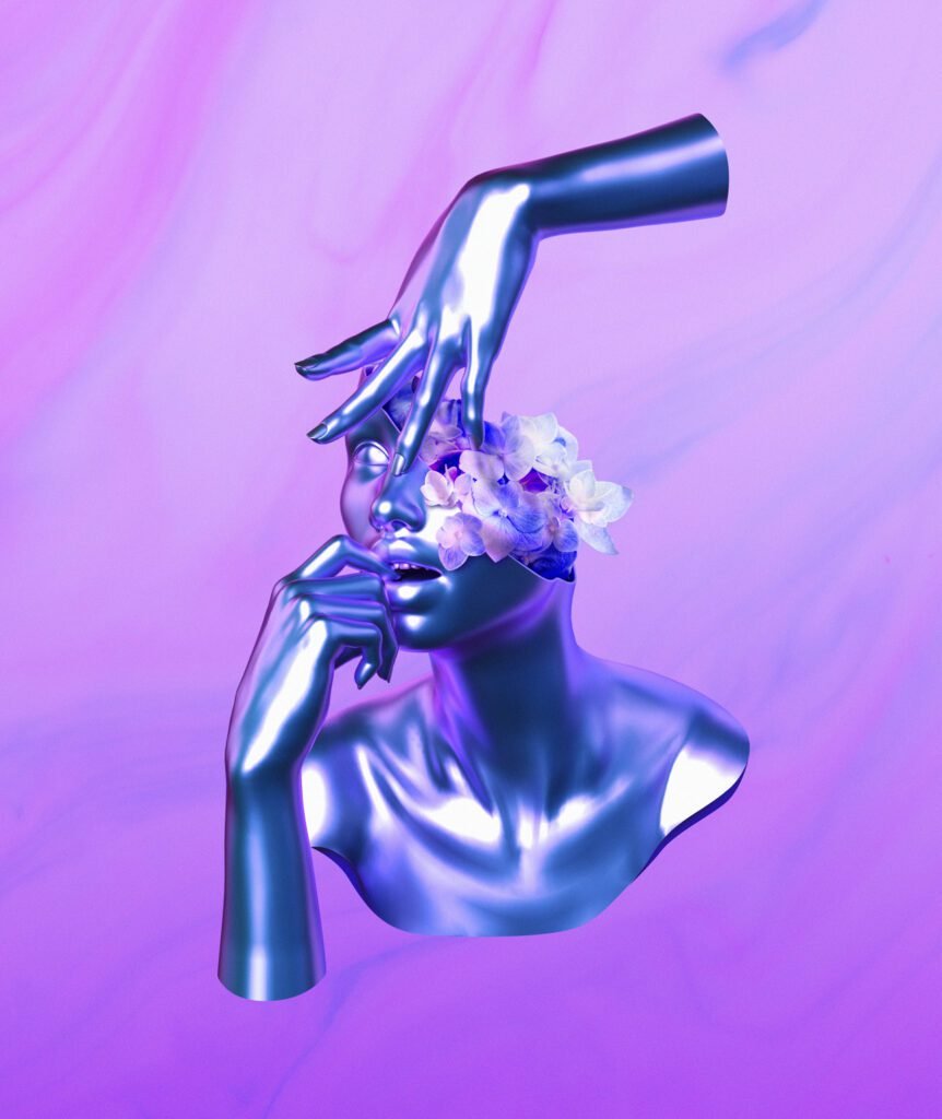
We’ve already begun to see this energetic pastel’s influence in art. Especially with a big focus on the future. This subtly colorful surrealist style will only get more and more popular this year.
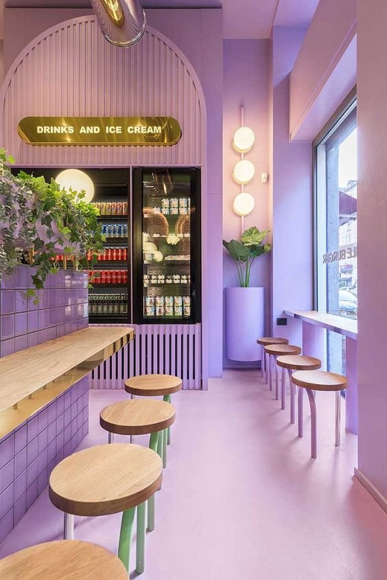
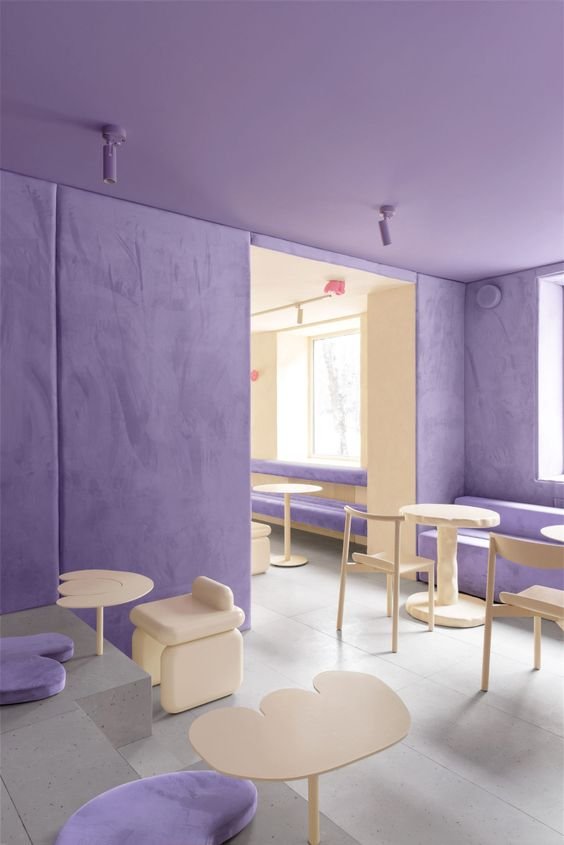
Very Peri will also likely manifest itself not only in corporate branding, but also in commercial interiors/exteriors. Brands will be drawn to incorporate this color in spaces to give it a futuristic and peaceful yet inspiring vibe. This will likely show up in companies that specialize in self care, retail brands, creative boutiques, and more.
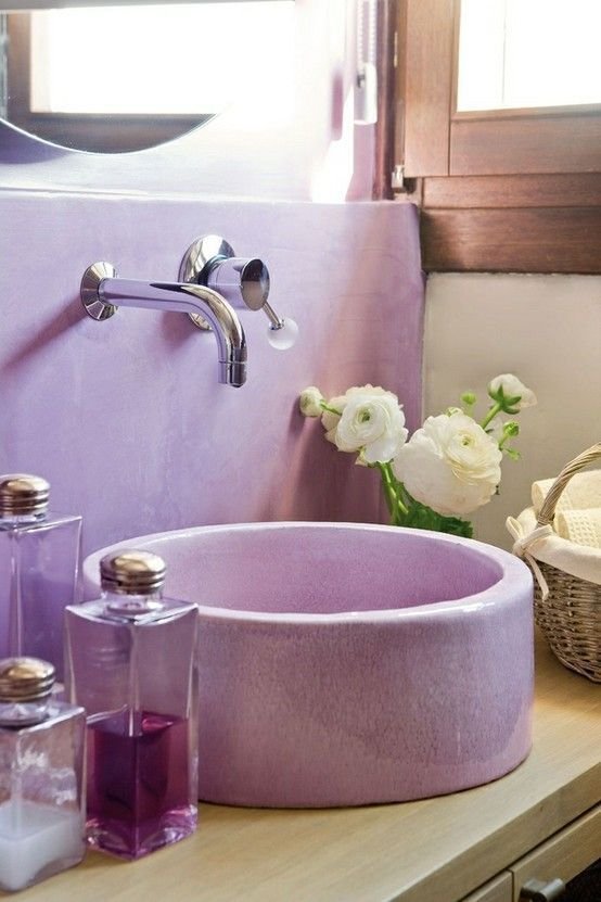
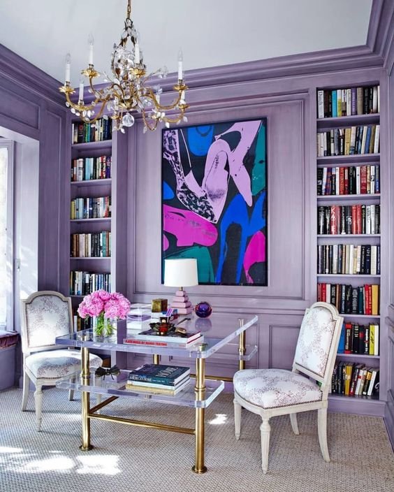
In the same vein, we may also see the color popping up in residential interiors in rooms like home offices or bathrooms. In home offices, people will want to extract the inspirational energy form Very Peri. While in bathrooms or vanity areas, the calming nature will be an asset.
Curious what kind of color palette Very Peri could fit into? Check out Pantone’s suggested schemes.
want to stay up-to-date on all the latest trends in design?
Subscribe to the homey homies hub and get a full rundown on the latest in interior design, creativity, and beyond every other Sunday. Pride yourself on always having your fingers on the pulse of design.
Your Complete Guide to Interior Design Trends
Want to know more about where interior design trends come from, who decides them, why some stick while others don’t, and how to apply them while maintaining your own personal style? Check out my complete guide blog post.
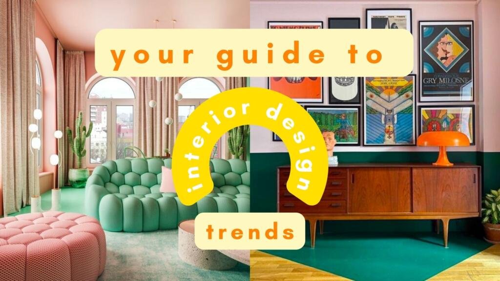
Looking to dig into some other interior design trends? Check out the trend alert posts below:
About me
Hey my name’s Hannah Michelle Lambert, the voice behind homey homies. I’m an LA-based designer, writer, and content strategist. I’m passionate about the intersection of productivity and creativity. I love talking about creative habits, technology, processes, and everything in between that helps me blend the Type A and Type B parts of my brain.


Leave a Comment