I just saw The Sorry Girls’ YouTube video where they are redesigning a famous cartoon room the other day, and I was inspired. They did The Simpson’s and Spongebob’s living rooms. And I would definitely check it out if you haven’t seen it yet. I did something similar where I attempted to recreate, as exactly as possible, rooms from The Jetson’s house. But doing a whole update/redesign? That’s even better!
So I thought I would hop right on this trend and do one of my own.
The room I tasked myself with redesigning Muffy Crosswire’s room from the show Arthur.
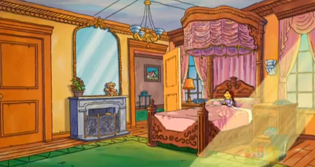
It’s massive room that gives me Parisian vibes. It definitely fits her spoiled rich kid attitude. Clearly, though, it needs a little bit of an update. I decided to run with the Parisian luxury vibe and just refine it and modernize it.
and here’s what I came up with
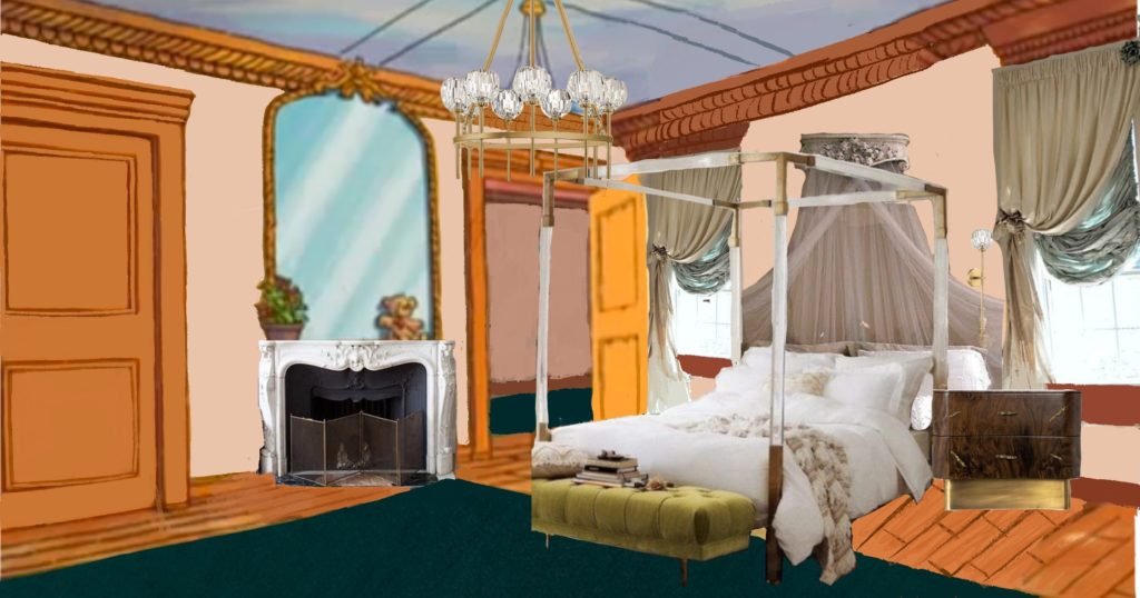

Pardon the little bit of sloppiness. I’m still getting the hang of procreate, so cut me a little slack please :0
what changed?
- I had to get rid of those god awful, piss yellow walls. I decided on a pink-ish, peachy color that is both feminine and sophisticated. This color also corresponds well with the original crown moulding, which is an orange-y, reddish tone.
- That ugly green rug had to go, too. I swapped it with a darker, blue-green to bring some more modernity and maturity to the room.
- Who made the decision to put a fucking blue fireplace? Switched that shit out for a decidedly more Parisian, cream-colored fireplace. I kept the mirror above it though. That was a big part of my inspiration for the whole room.
- The chandelier. Simple change, just a little more elegant and modern.
- I loved her grand, royal-looking bed, but the pink color and bulkiness didn’t sit quite right. The tall, grand nature is maintained with the canopy bed frame, but it is a little dreamier with its gold and clear accents, as well as the more neutral styling. The ottoman at the end helps to fill big ass empty space that I guess wasn’t being used before for some reason.
- New nightstand. Muffy is too snobby to have a boring ass, simple wood nightstand. We upgraded her to a curved, dark wood statement piece with gold accents.
- To match the new bedding, we had to swap out the drapery as well, including the curtains and the canopy. The neutral allows for them to be loud in their movement and volume without being overwhelming.
what would you do differently?
I’m pretty pleased with the way it turned out, and honestly, I wouldn’t mind living there.
I’d love to hear in the comments below what ideas you’d have if you were going to redecorate this room. Or better yet, redecorate it yourself and tag me on Instagram! And feel free to let me know if you like to see me create a series out of redesigning a famous cartoon room.
keep it homey, homies
About me
Hey my name’s Hannah Michelle Lambert, the voice behind homey homies. I’m an LA-based designer, writer, and content strategist. I’m passionate about the intersection of productivity and creativity. I love talking about creative habits, technology, processes, and everything in between that helps me blend the Type A and Type B parts of my brain.




Leave a Comment