Mid century modern is a staple style in interior design. Across the board, design enthusiasts are obsessed with it. And for good reason. It’s equally classic and trendy. MCM is is also very adaptive. You could play it down in a more minimalist way, but you can also play it up in a more fun and eccentric way. In this post, I’m going to go through all of the mid-century modern interior design essentials.
I’m gonna lay it all down for you. You get a brief history on the style. I tell you some key components that make it unique. And you have a complete Amazon hopping list to buy all of the mid-century modern essentials. And of course, I tried applying a decently budget-friendly lens to this list. (With a few splurge options mixed in as alternatives)
so where did mid-century modern interior design come from?
This one is pretty easy since it’s right in the name. The mid-20th century.
More specifically, it was the mid-1940s to late 60s, after WW2. And it was a subset of the larger modernist movement of the time, rather than a distinct style.
MCM has an association with the arts and culture. That’s because this was when the modernist art movement was really in its prime, too. And you’ll see this style played out in the glamorous ad world of Don Draper in Mad Men. The glamorous but not overly ornamental style you see in that show is the vibe of mid-century modern to a tee.
This style grew in America because of its emphasis on function, rather than the busyness and ornamentation of the styles immediately before it. People wanted simple, streamlined, and sophisticated design. And since it was born in the industrial revolution, an emphasis was but on using new materials like steel, glass, etc. There’s often a blend of various (and sometimes contrasting) materials.
This subset grew in popularity when architects like Frank Lloyd Wright and Le Corbusier and furniture designers like Arne Jacobson and Eames carved out a specific aesthetic.
p.s. thanks IDI for giving me all this solid background on where these styles came from 😉
what does MCM design look like?
As I said, this era was about simplicity. The broadest way to describe mid-century modern design – both interior design and architecture – is low, horizontal, and asymmetrical with clean lines.


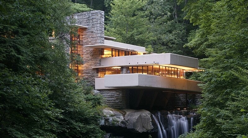

In addition to the “new” kinds of materials like metals and manufactured textiles, there is often lots of wood present in MCM design. Especially in a walnut finish.
Some more sophisticated MCM design is more minimalist, but when it came to the everyday mid-century modern home’s design, there is often lots of patterns. These patterns tend to have a biomorphic (abstractly mimicking nature) or geometric influence. Just think of the wallpaper or blankets in your cool grandma’s house.


The color palette is extremely varied. Some design has an emphasis on neutrals, other on contrasting black and white, and some is more colorful. But below are some of the key colors that occur most often in the mid-century modern interior design we see today.


here are the mid-century modern essentials: your amazon shopping list
I broke it down for you and put together a complete shopping list for all of the mid-century modern interior design needs. From major furniture to accessories and home decor, this list should set you up for MCM success.
Some of these are more minimalist in nature, and some are a little more adventurous. Feel free to pick and choose what you want. So buckle in, and we’re going to go through all of these amazing (and mostly affordable) pieces. Simple click on the pictures to shop them online.
But first, here’s a sneak peak at what the vibe for the full space is.


the big stuff: main furniture pieces
Here are the pieces that ground your room. I always recommend going more understated on these pieces. For budget’s sake, you want to avoid pigeonholing yourself into a very specific aesthetic for when you inevitably want to change things up. (Unless you get it for real cheap thrifted, then go crazy).
So here are some simple, yet quintessential mid-century modern pieces.
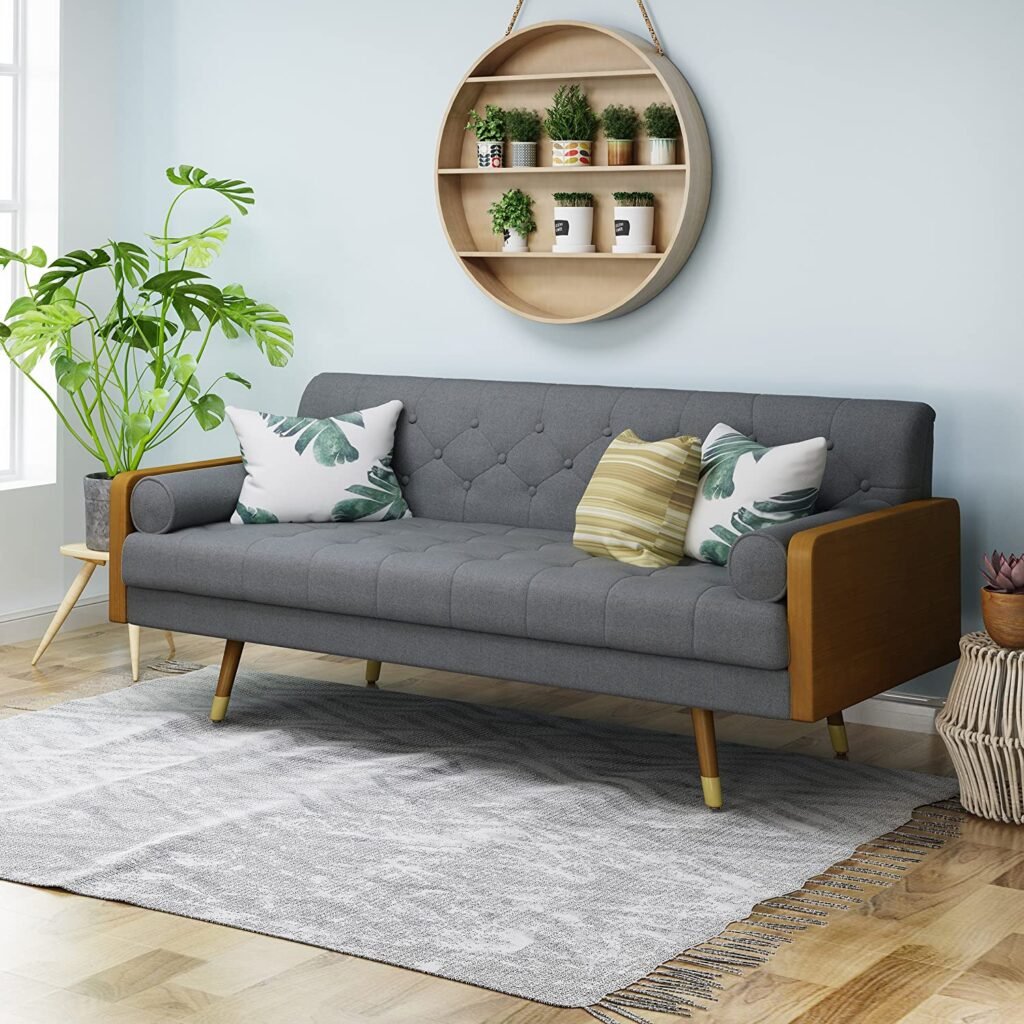
couch
This has some of the key attributes of MCM: wood detailing, streamlined design, and angled minimalist legs.
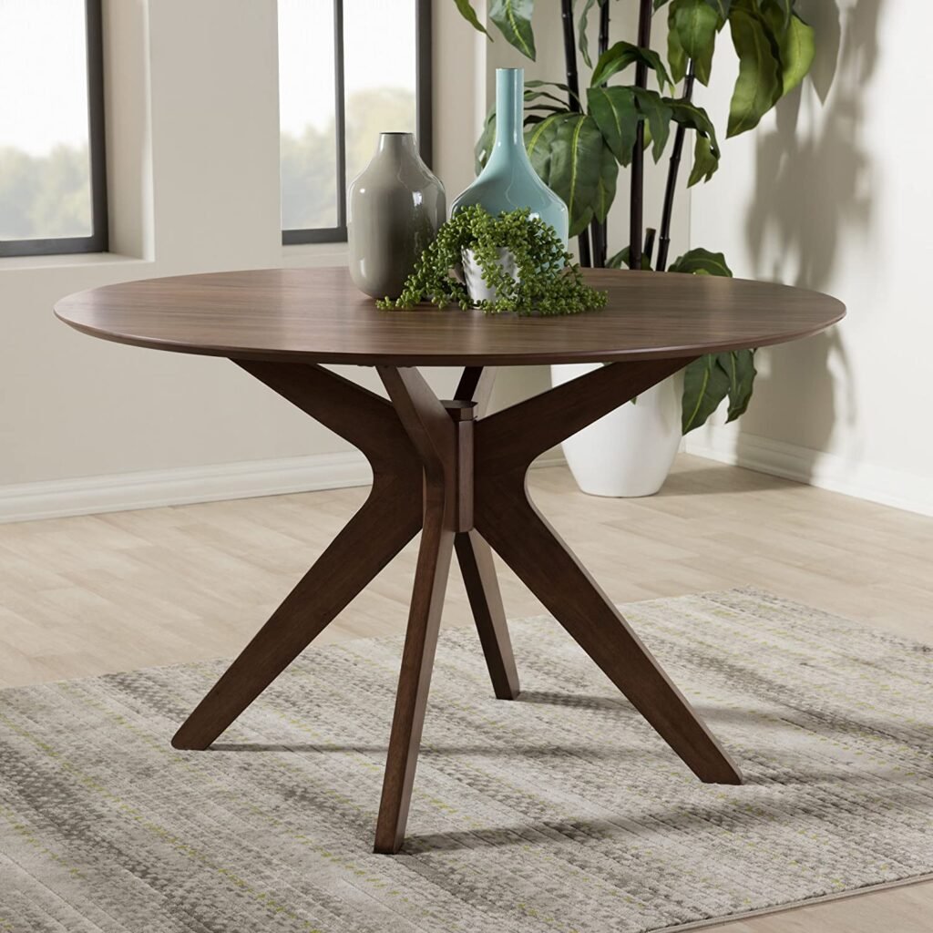
dining table
This has the rich walnut color that is so popular in this era. And this style of legs is very MCM. It’s interesting yet still minimalist.
smaller staple pieces
These items are core furniture pieces, but they’re a little smaller and easier to experiment with since they’re typically not as expensive.
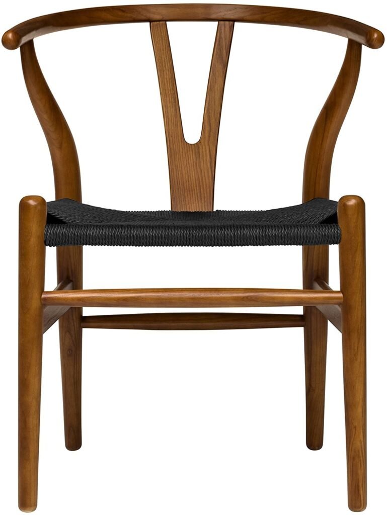
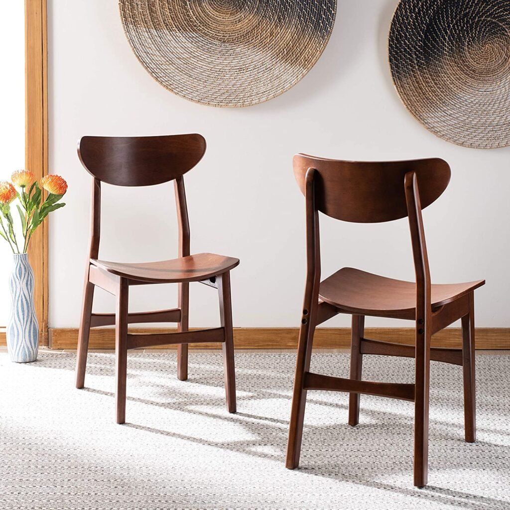
dining chairs
Wishbone chairs are one of those iconic furniture pieces from mid-century. So if you want to really make a statement, this is the way to do it. I found some really great dupes on Amazon.
But if you want a more affordable option, these chairs clearly have a Wishbone influence, but with a more modern spin.
coffee table
Hairpin legs are a staple. And here is a great example of mixing old materials (wood) with the new (metal)
tv stand
More walnut wood and angled minimalist legs. Plus, that emphasis on horizontal lines I was talking about.
accent furniture
The following kinds of furniture aren’t a necessity in the home like the stuff above. But they offer some great design opportunities to further solidify that mid-century modern interior design vibe. And in some cases, they’re functional if space allows – i.e. more seating and a place to set your drinks.
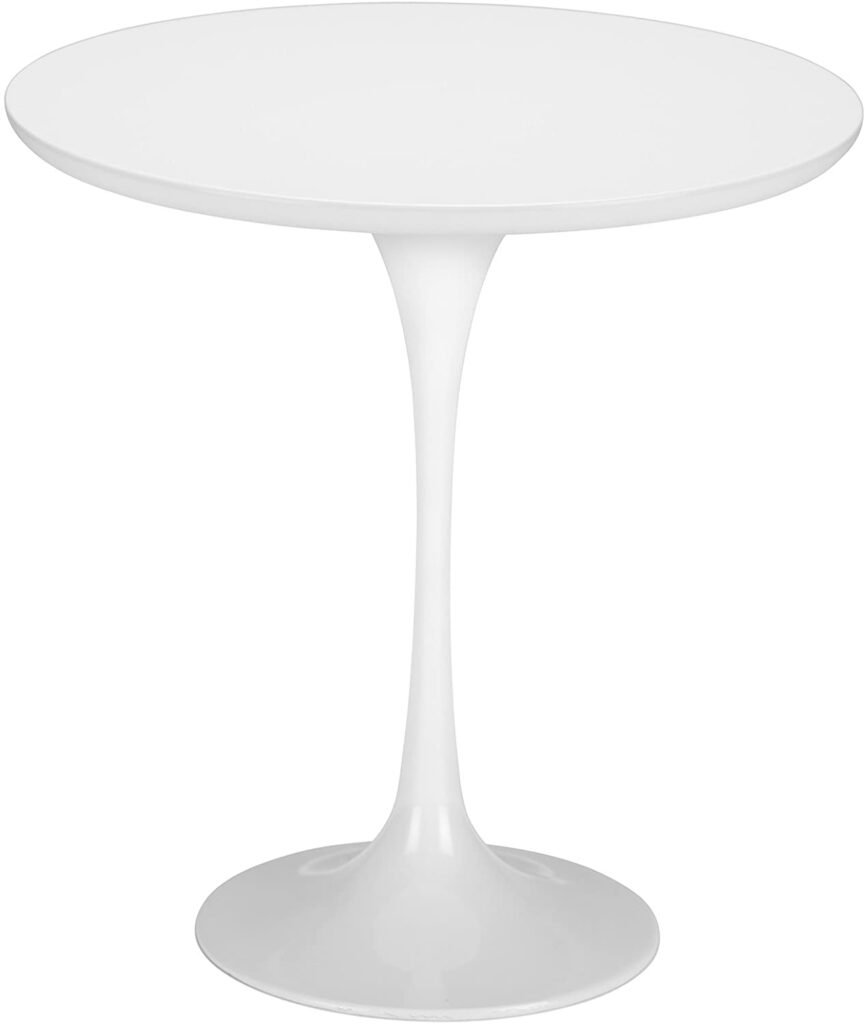
tulip side table
The tulip shape was iconic in this era. I love a good tulip dining table, but it’s also great for a lower-commitment side table like this.
rug
Here you can see the geometric influence, as well as the typical MCM color palette. I love making a more colorful statement in a rug. It’s easy to swap out if you want to change up the colors.
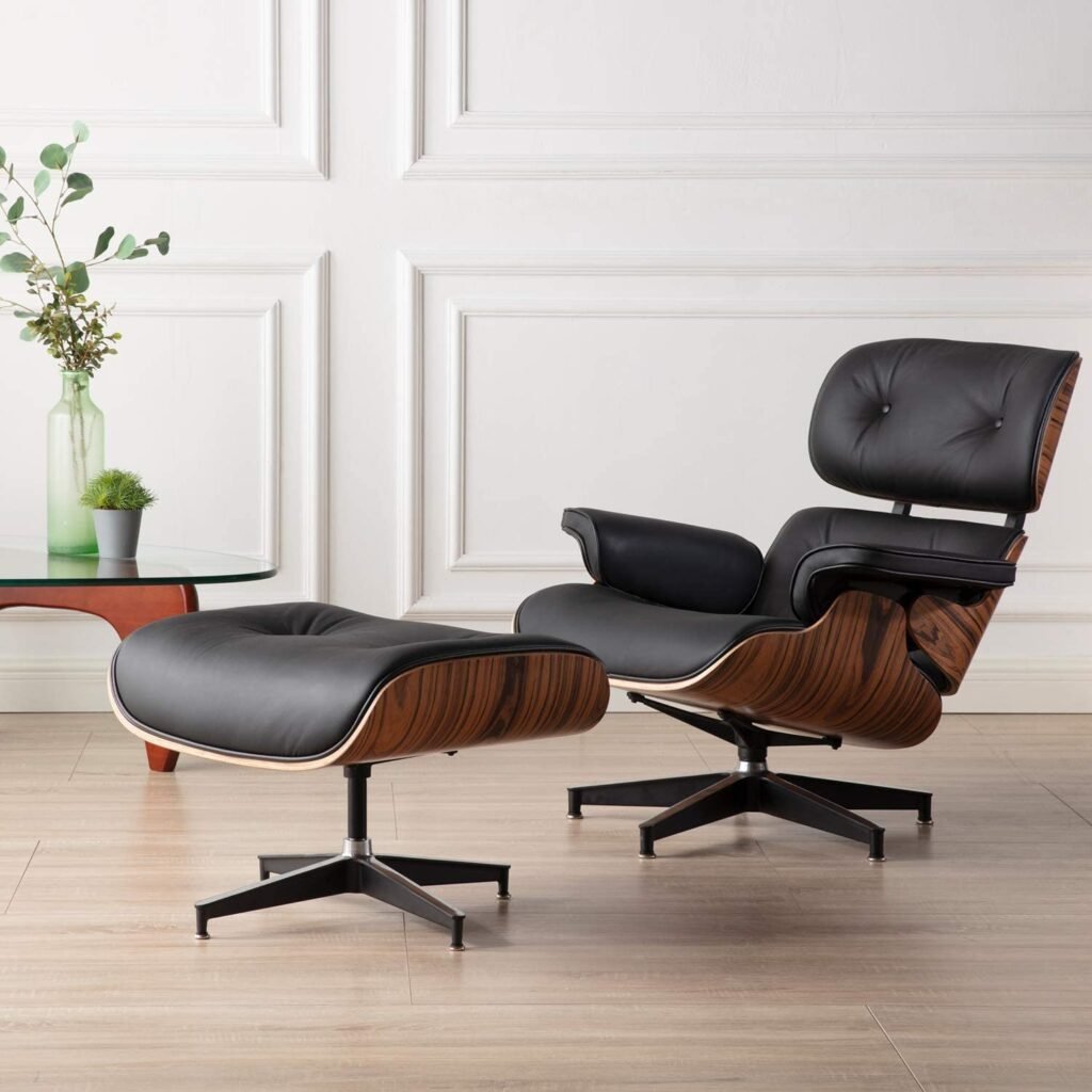
“Eames” chair
This is a dupe of one of the most notorious chairs of the time period. This is a dupe, but it’s still a bit of an investment. But this style is timeless and immediately communicates the MCM-ness of your space.
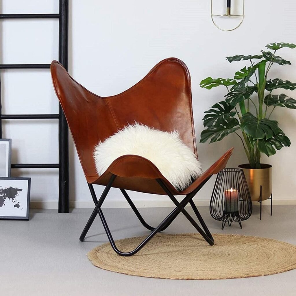
butterfly chair
Okay I get it if you don’t want to pay that much for the Eames dupe. So here’s a more affordable dupe of another famous mid-century modern chair! The butterfly chair. Did you know that a chair you probably had in your childhood bedroom had such a rich history?
This is a more mature spin on the popular childhood chair, though.
side chair
Last chair suggestion, I promise. This is for the people who wanna keep it classic. This is less of a statement and more of a simple, grounding MCM chair. The color, the streamlined design. Very mid-century.
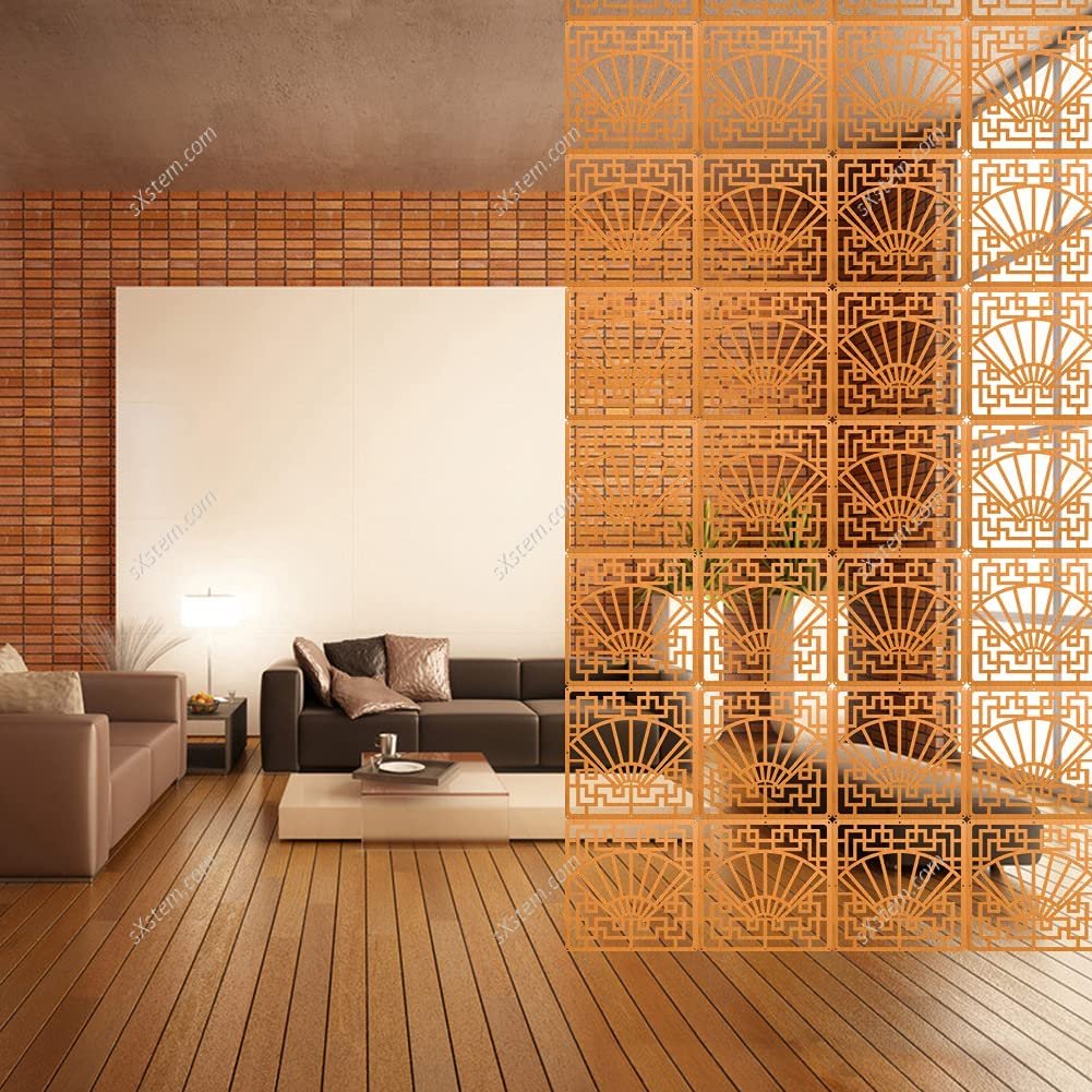
room divider
People LOVED their room dividers. And honestly I do, too. Open floor plans were popularized during this time, so sometimes room dividers were necessary to add a little bit of separation without the rigidness of a wall.
Here’s a fun option that brings in the geometric influence and the fun colors. It’s also super cheap and easy to install.
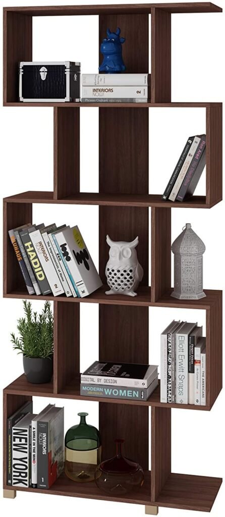
But if you want a more classic, but still amazing, option, you could also use a nice wooden bookshelf as a mini room divider.
accessories
I’m all about the accessories, babayy. This is where you can bring your place alive. Even if you keep the rest of your house pretty basic, this is where you can make some pretty great statements.
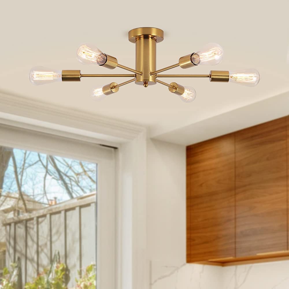
lighting
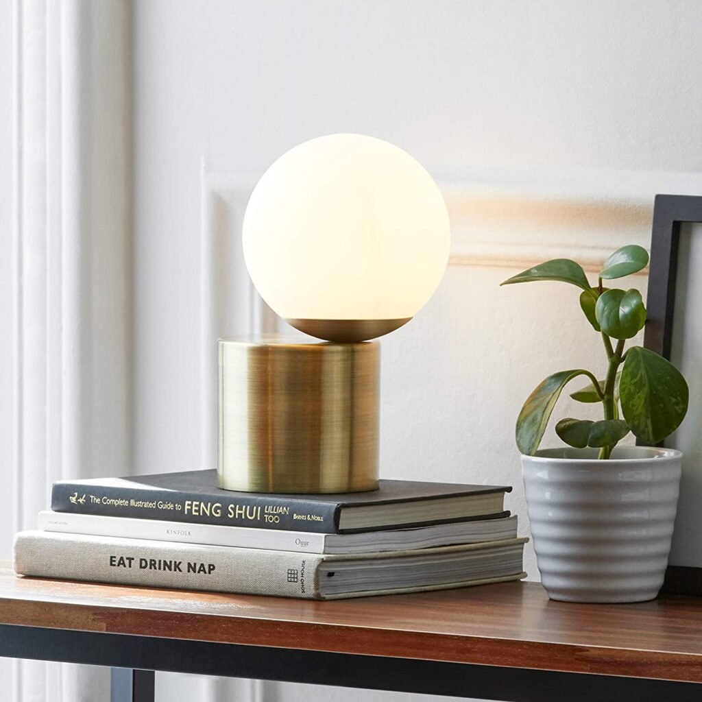
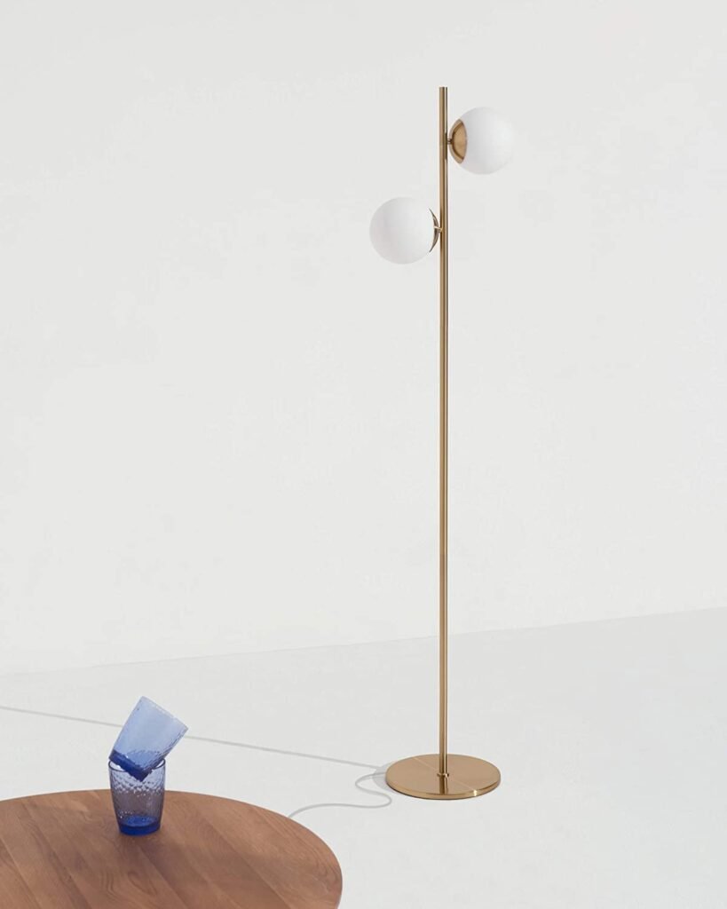
Lighting is one of the most crucial mid-century modern essentials. It’s a great chance to play with some geometry and add in subtly gold accents that were so big then.
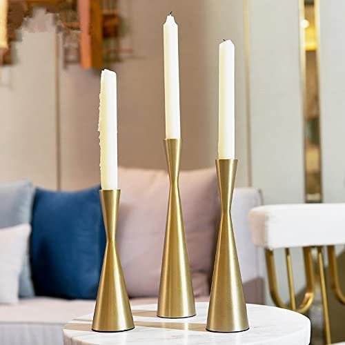
I’m going to consider candlesticks lighting. Because whatever.
wallpaper
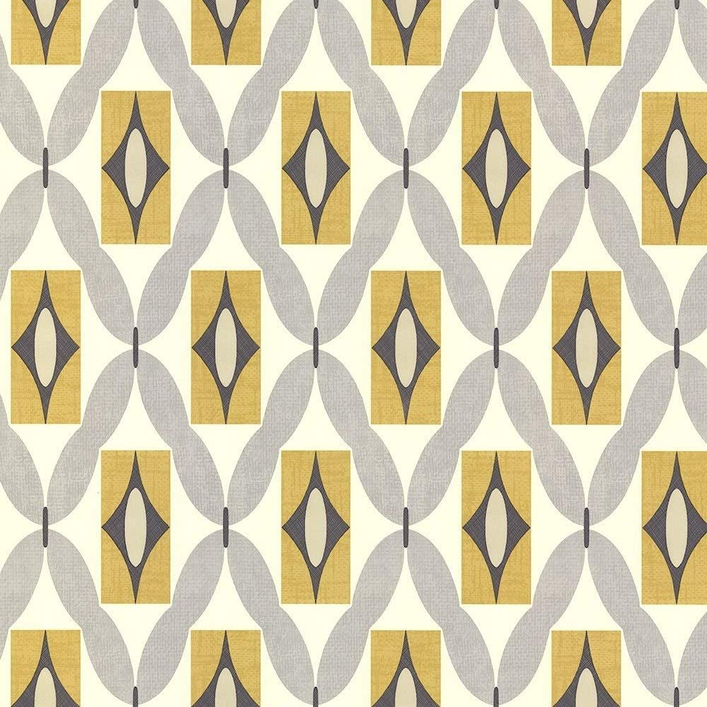
Peel and stick wallpaper is one of the best inventions I’ve ever witnessed. So cheap and so fun to play around with. This one is very typically retro MCM with the mustard color and the repetitive, geometric-ish design.
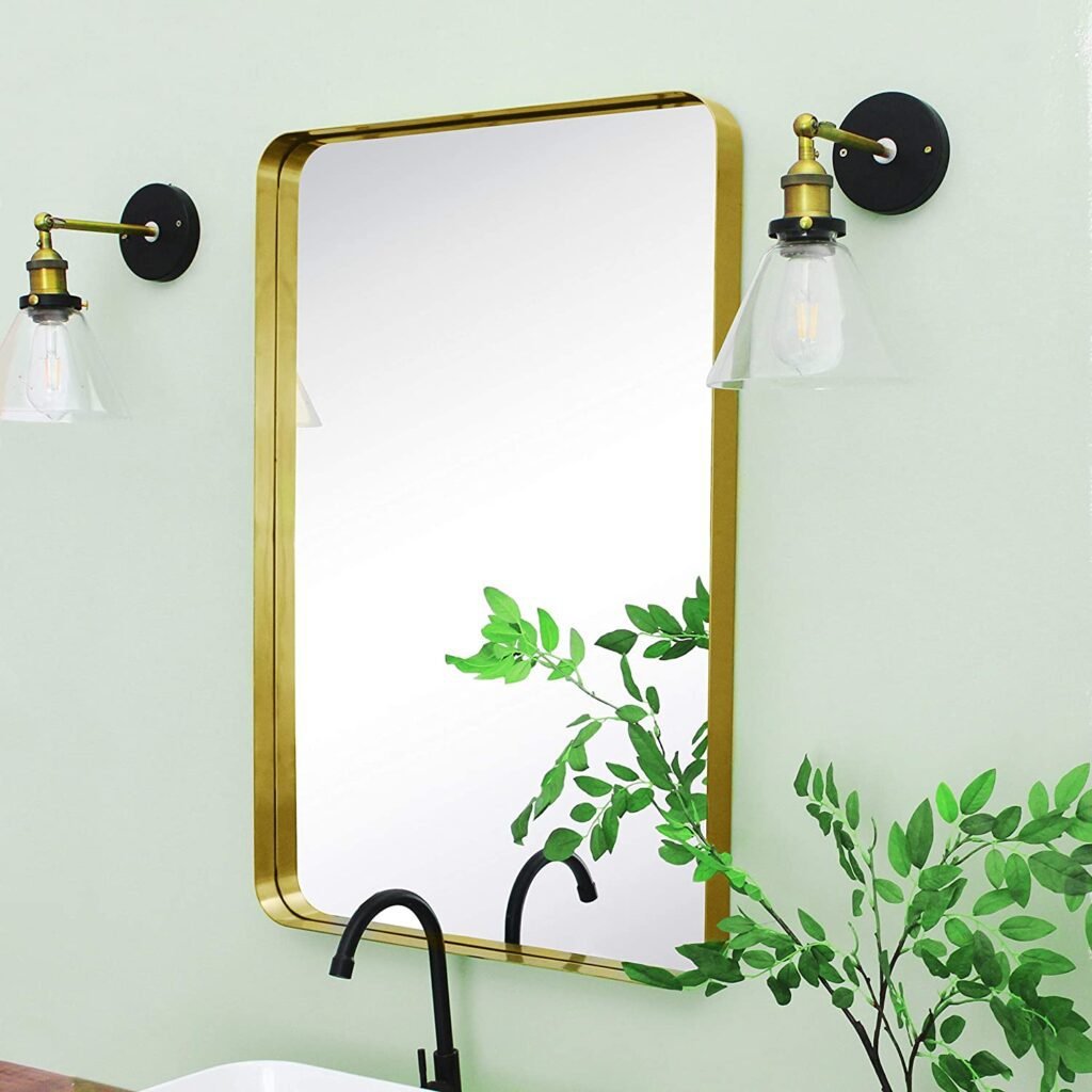
mirror
More gold accents. A simple design. All the necessities.
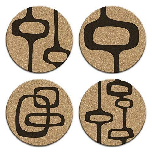
coasters
I’m a big coaster girl. These ones are so fun and really give you that retro feel.
other honorable mentions
- Wave shag runner rug
- MCM graphic design coffee table book
- Set of 6 neutral art prints
- Walnut wall art
- Colorful abstract art prints
- MCM-stylized Crosley speaker
- Walnut/off-white console table
those are my mid-century modern interior design essentials
I hope this was helpful for you! I had a lot of fun giving you a mini history lesson and sharing some of my favorite staple pieces.
Like I said, this trend is super broad, so (as with any design) there’s not just one single way to do it. But this is a really good starting point if you’re looking to start a MCM design project.
Choose what ya like from the list, experiment, and fill the rest of your space with stuff you love. Adding your own personal style is what makes the difference between good design and great design.
Have fun decorating, and
keep it homey, homies
Your Complete Guide to Interior Design Trends
Want to know more about where interior design trends come from, who decides them, why some stick while others don’t, and how to apply them while maintaining your own personal style? Check out my complete guide blog post.

Note: This post may contain affiliate links. This means that I may get a small commission if you make a purchase. This has no impact on price for you – it comes out of the seller’s pockets.
About me
Hey my name’s Hannah Michelle Lambert, the voice behind homey homies. I’m an LA-based designer, writer, and content strategist. I’m passionate about the intersection of productivity and creativity. I love talking about creative habits, technology, processes, and everything in between that helps me blend the Type A and Type B parts of my brain.







Leave a Comment