I am pretty much a lifelong Apple fanatic. As a big fan of design – interior, architecture, fashion, and product – the simple, beautiful and streamlined design of Apple products makes my heart happy. So of course, I had to get the new blue M1 iMac as soon as it dropped. There really is no difference between little kid Hannah and today’s Hannah: always blowing my money on tech.
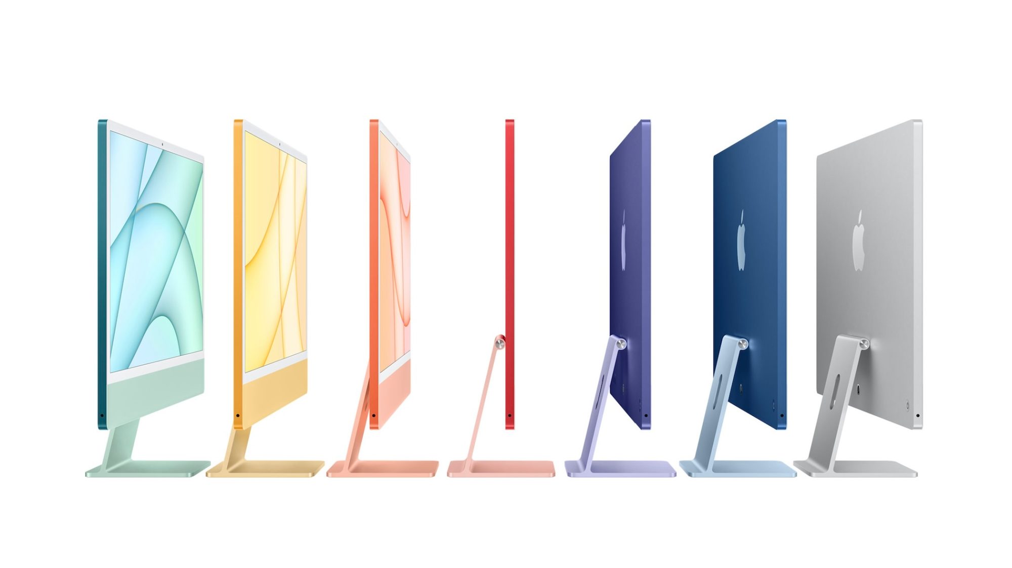

These computers excited me more than I already would be for a new Mac. THE COLORS. I am a complete color lover, so the fact that my computer can now come in one of my favorite colors is exciting.
I went back and forth (and back and forth) on which color I wanted. Did I want blue? Yellow? My longtime favorite, orange?
I ended up going with this beautiful sky blue.
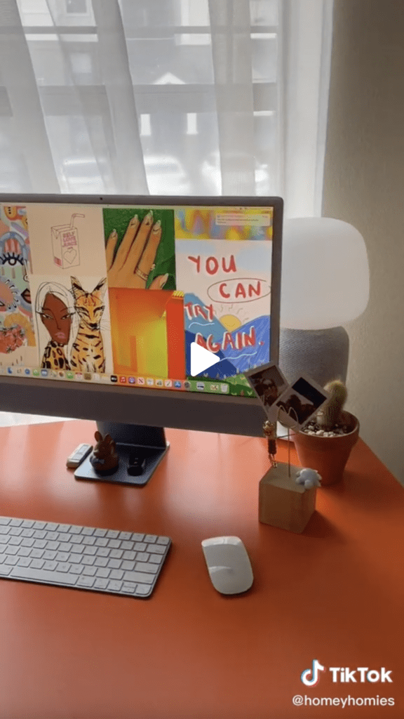
Baby blue was my OG favorite color from childhood, and I love the contrast it adds with my bright orange desk. Not to mention it brings out the same blue in my sewing machine.
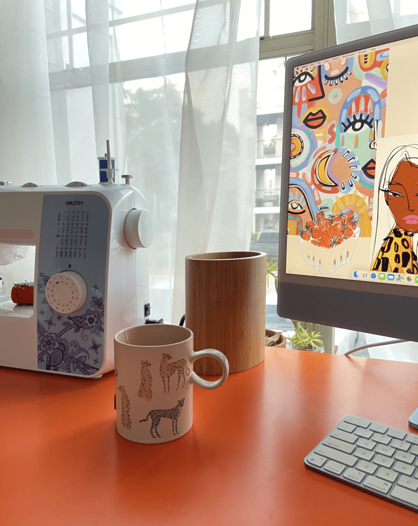

So now to the point of this post… let’s design an office around this blue M1 iMac!
As much as I love this computer in my own office, I immediately started dreaming up a custom-designed office to complement the colorful, streamlined design of the blue M1 iMac.
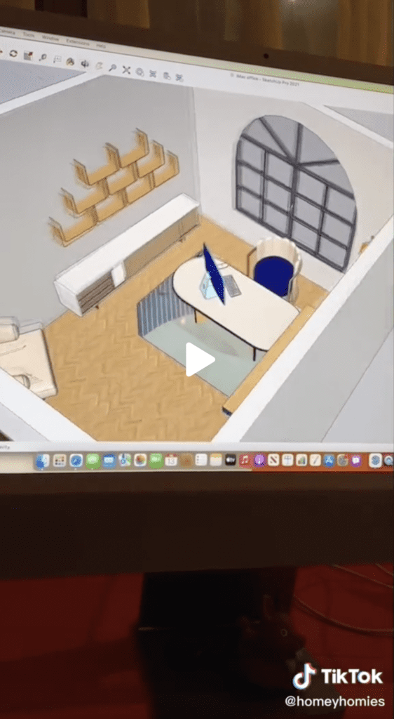
And with the help of SketchUp, I was able to bring that design to life.
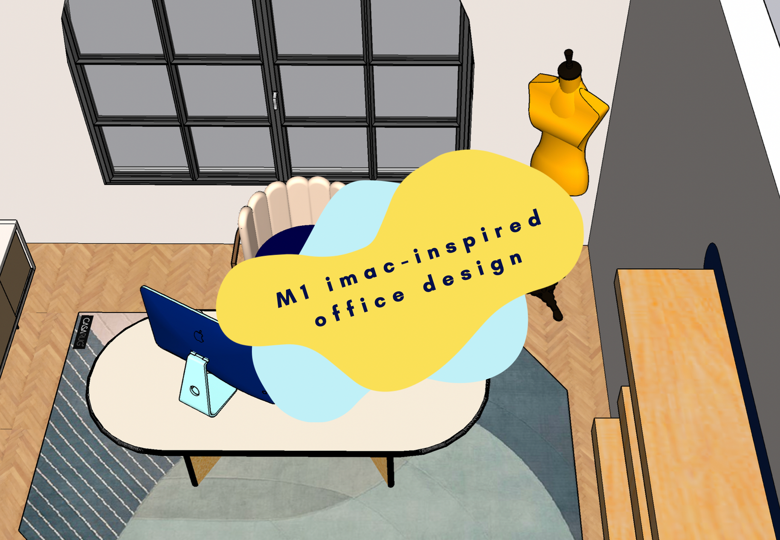
My idea: There’s something about the baby blue and cream color combo that’s so right. Plus I added in the navy blue from the back of the computer . With a lil yellow sprinkled in for a little razzle dazzle.
In terms of the vibe, I wanted simple but striking. And my favorite way to achieve this look is through organic shapes. This was partly inspired by the accent color I’d already been planning to add to my own home office.


I wanted round shapes, imperfect proportions, but not too busy. So the most intricate detail was the rug. The accent corner painting made it into the design, and I added some oval painted details behind the floating shelves.


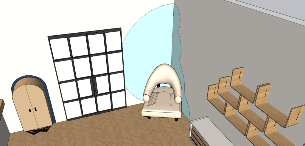

Even the desk and bar cabinet followed the trend of the rounded, organic shapes. Of course I had to add in a bar cabinet if I wanted to create my dream office.
And I added in some interesting-shaped wood shelves above a classic midcentury cabinet to add some practical details to the room.


To put the cherry on top of everything, I threw in a yellow dress form for a pop of color and a unique touch. The cream accent chair because every office needs a comfy lounge area. And, of course, the iMac. The star of the show.
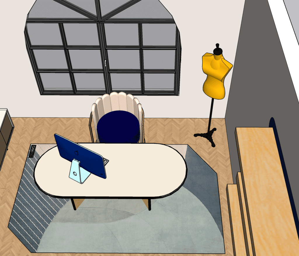

the design of the actual room
While all of the painting and styling is the main purpose here, sign I was designing from scratch on SketchUp, I could decide what I wanted to room itself to look like.
So I added in an arched window to match the other rounded details. And nice, big French doors to add to the open and friendly vibe of the room.
I opted for a simple light cream color for the walls to keep it neutral. And my favorite kind of flooring: an ashy herringbone.


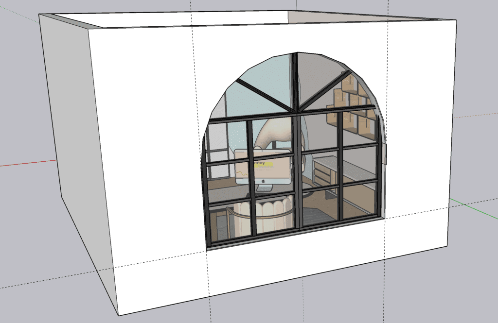

the outcome: serious envy of an office that doesn’t even exist
Although I love my office more than any other room in my house, I gotta be honest. I’m a little jealous of this imaginary room.
This room seems like the perfect place to do some creative brainstorming (maybe with a drink from the bar cabinet in hand??), get some sewing done, and blog to my heart’s content.
I loved dreaming up this room to fit my new favorite office accessory! Let me know in the comments below if there are any other room mockups you want me to do! (And it’s only partly because I want the excuse to use SketchUp on my super powerful new blue M1 iMac).
keep it homey, homies
About me
Hey my name’s Hannah Michelle Lambert, the voice behind homey homies. I’m an LA-based designer, writer, and content strategist. I’m passionate about the intersection of productivity and creativity. I love talking about creative habits, technology, processes, and everything in between that helps me blend the Type A and Type B parts of my brain.




Leave a Comment