As many of you might know, I just finished up my program with the Interior Design Institute. And a huge part of the course was a mock renovation of a single family home. The initial brief was to make it more of a modern, open floor plan for a family of 3. I decided to go with a monochromatic orange, retro/midcentury modern feel.
I’m super proud of how it turned out, and honestly I would move in in a heartbeat, so I thought I’d share!
the floorplan
Other than changing the outer walls and the placement of the stairs, we were free to knock out any walls we wanted. And knock out I did. Here’s what the floorplan looked like originally.


And here’s what my version ended up looking like.
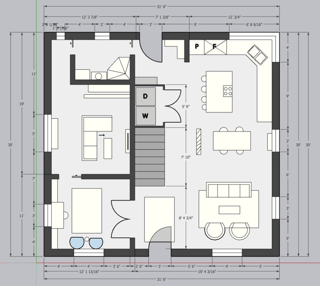

I basically just flipped the floorplan so that you could enter right into the open living/dining space. My main goal in doing this is was to make it feel more inviting and easier to navigate both for entertaining and everyday life.
Some of the things the brief mentioned on the clients’ non-required “wish list” were a guest bedroom and a study. But to me, a room that is just a guest bedroom is a waste of space a majority of the time. So instead I connected the study with a pocket door to a game/entertainment room that has a sectional that can convert into a bed. Most of the time, this will be the spot for the family to gather, but when needed, guests can stay there. And it’s conveniently connected to a small full bath.
the inspiration
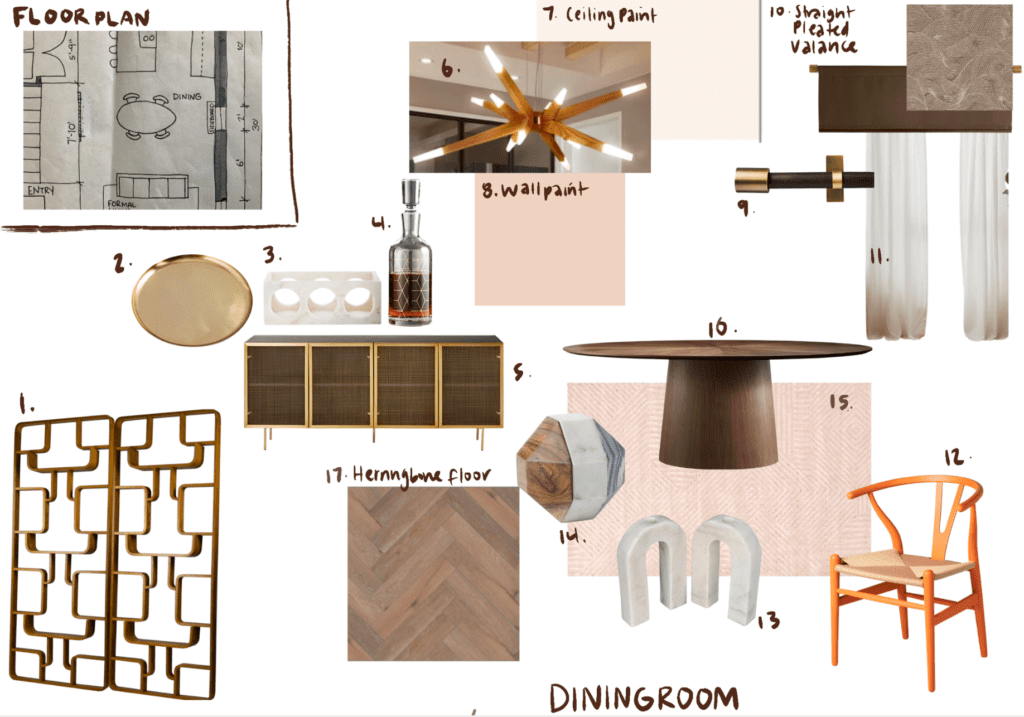
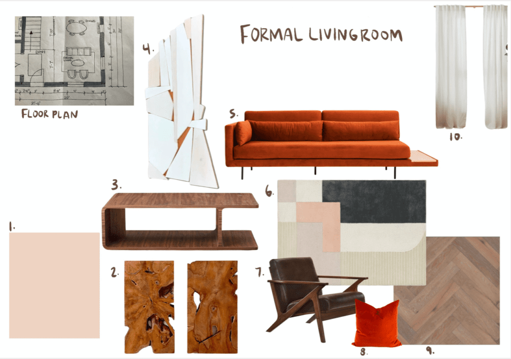
Okay so once I had the bones of the house in place, it was time to get to thinking about what these rooms would look and feel like. As I said before, orange, retro, and midcentury modern are the name of the game here. I threw in a little bit of geometric influence as well. I wanted the space to be inspiring and colorful, yet still relaxing. The orange everywhere brings the excitement, while all of the ashy wood tones mellow it out a bit.
Here are the sample boards I created for each room that laid out the vibe I was going for.



now, the 3D model
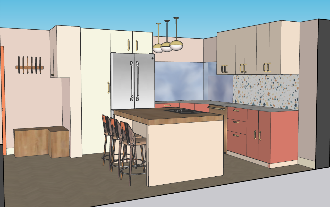
I’m so glad that I was able to take the advanced IDI module on SketchUp so I could learn how to turn my ideas into a realistic model. It took so fucking long, but the end result was worth it.
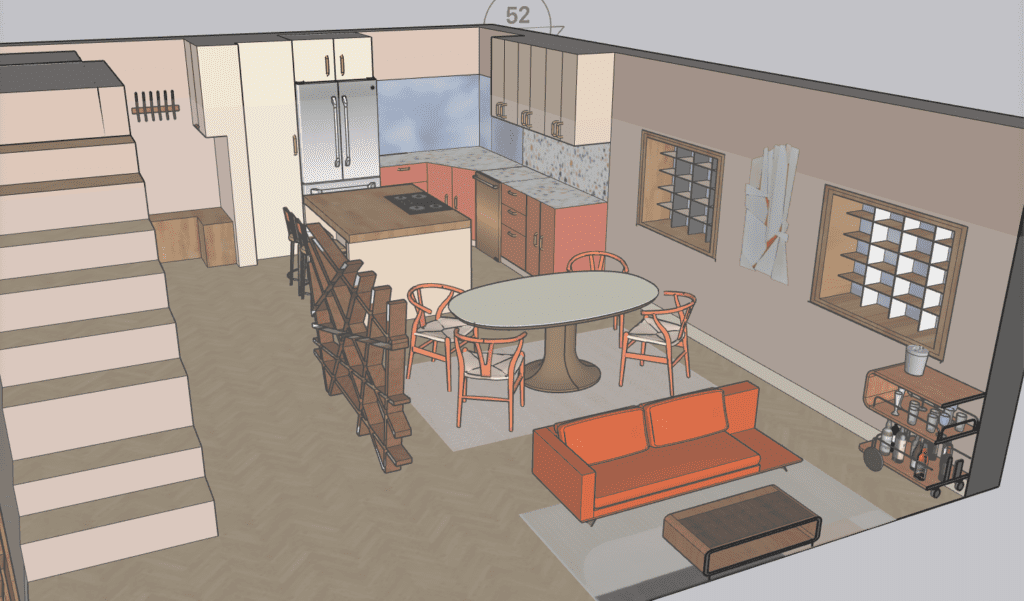

I originally had an idea for a decorative patterned glass wall in place of the wooden structure there, but I had the hardest time finding anything remotely similar. So I found this weird, cool wooden thing instead. The thought process behind this was to create some sort of a hallway and a distinction of space in an open floor plan. This does that, while allowing it to still be very much so open.


I absolutely die for this terrazzo countertop and backsplash. When I build my own home, it WILL have this in it.


This guest/family/game room is one of my favorite places in the house. It’s hard to see here, but there’s a giant bench and project table towards the back of the room underneath the photos. This is the space where the kids can do homework, play games, draw, or eat while they’re watching the movie. Versatility is key in this room, and I think this little area is exactly that.


want a video tour? i gotchu
Check out my IGTV video below to see what a walk through the house would look like.
Although I’m definitely riding that learning curve hard, I’m super proud of how this whole project came out. Let me know below if you liked this and want to see more mock projects. And I have some real life projects coming your way VERY soon as well 🙂
keep it homey, homies
About me
Hey my name’s Hannah Michelle Lambert, the voice behind homey homies. I’m an LA-based designer, writer, and content strategist. I’m passionate about the intersection of productivity and creativity. I love talking about creative habits, technology, processes, and everything in between that helps me blend the Type A and Type B parts of my brain.



Your style is really unique in comparison to other people I’ve read stuff from.
Many thanks for posting when you’ve got the
opportunity, Guess I will just book mark this web site.
Thank you so much! I really appreciate that.
Woah! I’m really loving the template/theme of this blog.
It’s simple, yet effective. A lot of times it’s hard to get that “perfect balance” between superb usability and appearance.
I must say you’ve done a great job with this. Also, the blog loads super quick for me on Safari.
Outstanding Blog!
Thank you so much!
Just desire to say your article is as surprising.
The clarity in your post is simply spectacular and i can assume you’re an expert on this subject.
Well with your permission allow me to grab your RSS feed
to keep updated with forthcoming post. Thanks a million and please carry on the enjoyable work.
I do consider all the ideas you’ve introduced for your post.
They’re very convincing and can certainly work.
Still, the posts are very brief for novices. Could you
please prolong them a little from next time? Thanks for the post.
Hello There. I found your blog using msn. This is a really well written article.
I’ll be sure to bookmark it and come back to read more of your useful information. Thanks for the post.
I will certainly return.
I don’t even know how I ended up here, but I thought this
post was great. I don’t know who you are but certainly
you are going to a famous blogger if you aren’t already 😉 Cheers!
I’m impressed, I have to admit. Rarely do I come across a blog that’s both educative and interesting, and without a doubt, you’ve hit
the nail on the head. The issue is something too few people are speaking intelligently about.
Now i’m very happy that I came across this during my search for something regarding this.
I have read several just right stuff here. Definitely worth bookmarking for
revisiting. I wonder how a lot attempt you set to make one of these excellent
informative website.
Everyone loves what you guys are usually up too. This type of clever work and reporting!
Keep up the terrific works guys I’ve included you guys to my blogroll.
What’s up, I log on to your blogs daily. Your humoristic style is awesome, keep up
the good work!
Wow that was strange. I just wrote an extremely long comment but after I clicked submit my comment didn’t appear.
Grrrr… well I’m not writing all that over again. Anyway, just wanted to say
excellent blog!
Hi, just wanted to tell you, I loved this blog post.
It was funny. Keep on posting!
Hi, I log on to your new stuff on a regular basis. Your story-telling style is witty, keep it up!
My brother recommended I might like this website. He was entirely right.
This post truly made my day. You cann’t imagine just how much time I had spent for this information! Thanks!
Hey there! I’m at work browsing your blog from my new iphone!
Just wanted to say I love reading your blog and look forward
to all your posts! Keep up the great work!
Good site you’ve got here.. It’s hard to find high-quality
writing like yours nowadays. I honestly appreciate people like you!
Take care!!
Thanks for sharing your thoughts. I truly appreciate
your efforts and I will be waiting for your next post thanks
once again.
Hi! I’ve been reading your site for a while now and
finally got the bravery to go ahead and
give you a shout out from Porter Texas! Just wanted to mention keep up the good work!
bookmarked!!, I like your blog!