Add some depth and personality to your modern decor, for god’s sake
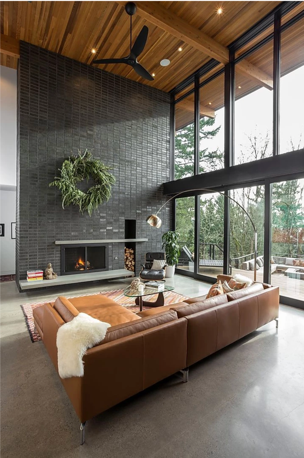

Comfortable modern interior design: How to add warmth to a modern aesthetic
I’m gonna say it. YouTube influencers have singlehandedly (okay maybe not quite singlehandedly) ruined the reputation of a modernly decorated home. So much so, that the phrase “comfortable modern interior design” seems like an oxymoron.
Because of them, when someone says “I like my home to look really modern,” I have war flashbacks of gray, mirrored furniture, gray, stark white ikea furniture, marble everything, and gray. It’s like a weird mix of sterile, lifeless, and a tacky attempt at “glam.”
Or when people just take it the ultra-minimalist route.
Prime example: Kim and Kanye’s creepy ass, post-apocalyptic lookin’ house that literally makes you feel empty inside just looking at it. Like what IS that??


I get it, I love clean lines and minimalism, too, but your home should feel like a home, not a museum. There’s a reason that there’s a distinction between commercial interior design and residential interior design: comfort and livability.
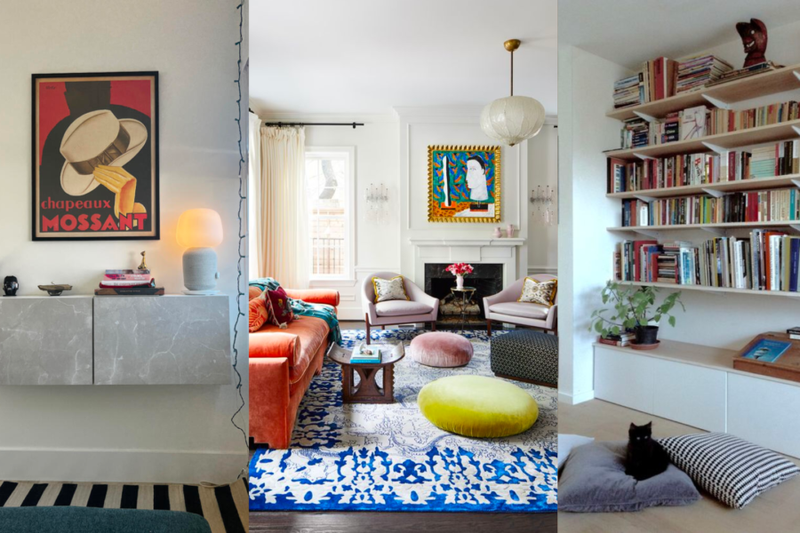
I think that the best modern decor is in homes where warmth and minimalism/modernism can coexist. Since some interpretations of “modern” pretty place it as the opposite of warmth, it can be tricky to know how to make this happen.
But I got you.
From personal experience, as someone who has always been drawn to a more modern aesthetic but still wanted it to have some life, I’ve picked up some tricks along the way. So no worries, I will not let my homey homies let your home fall to the ways of the poorly decorated YouTube apartment tours. Here’s how you can achieve comfortable modern interior design.
Pop some color in there
I get it, color can be scary. Why do you think most people end up going with a variety of neutrals in their home?
The thing is, in a house that’s more traditional and has more richness built into the style, a mixture of creams and whites and grays can work without feeling too sparse. But if your house is full of harsh lines and a minimal approach to decor, the lack of color can make it feel sterile.
Go as crazy or as subtle as you want, it’s all about what you connect with.
Here are some places to add color:
- a statement couch
- bold piece of artwork
- colorful armchair
- big vase or other accessories
- rugs, pillows, blankets
- paint a wall or door…
You see where I’m going here? You can literally add it anywhere. And it doesn’t have to be such a daunting idea.


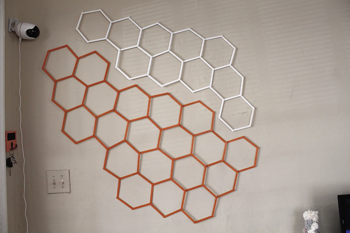
(How cool is this wall sticker? I came across it here.)
If you still find yourself a little timid with color, just try out a less-neutral neutral color, like this tan leather couch. It’s a little less of a commitment than a bold color, but still adds a lot of interest and warmth to the space.


Texture is your friend
This is a lesson that I didn’t learn soon enough. In my pursuit during my younger years, I always thought that modern meant everything needed to be sleek and smooth.
And yeah, those are some major components of the modern aesthetic, but that doesn’t mean that everything has to be textureless. One of the keys to comfortable modern interior design is the richness that texture brings with it.
Texture adds so much more depth and can transform what would’ve felt like an insane asylum to an actually inviting place to cozy up in.
Think of Kim K’s house. My ass hurts just looking at those chairs because of how aggressively flat and smooth they – as well as everything else around them – are. I mean, there’s really no fighting the creepyness of its fully monochromatic-ness, but like damn differentiate something in the space. Even a nice knotty cushion would go a long way on those chairs.
An obvious place to add texture is in pillows and blankets. I love a good thick knit blanket.
You can also add textiles to your walls. I DIY’d this wall art with a canvas, some shower rings and hot blue, and I love the way that its subtle 3D-ness adds a little extra oomph than a regular old piece of art on the wall.
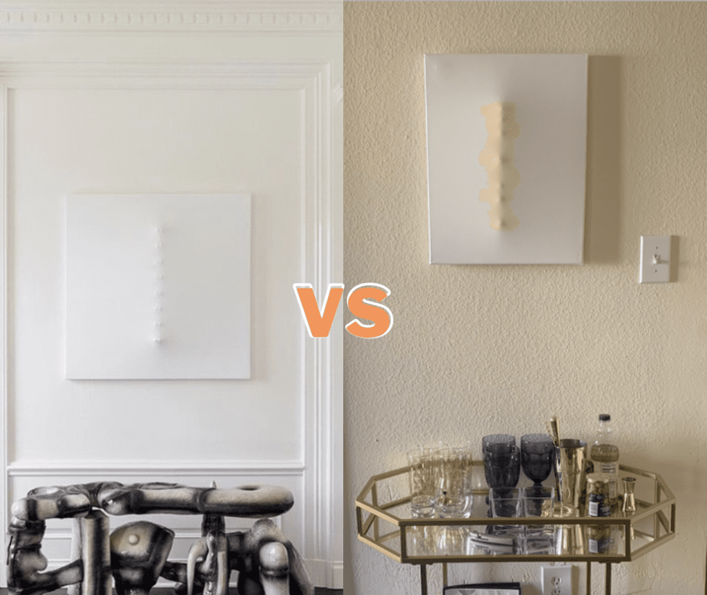

Other good places to add texture: a textural rug, rich curtains, plants, an ornate piece of furniture, knickknacks on a table, shelf or mantle.
If you’re down for a big change: a textured accent wall. The cool thing about this, too, is that there are TONS of DIYs on Pinterest using just wooden rods to create a wall like this.


Mix in some other design styles
This is a super simple fix. If you are scared of looking too modern, then just sprinkle in elements from other interior design styles you might have a little interest in. Eclectic interior design will never go out of style.
For me, this means adding some natural and industrial elements. A slab of wood as a centerpiece on a table, a couple plants here and there, tarnished metal bins, rustic-looking shelves like the one below.
All of these are potential ways to add an element of surprise in an otherwise flat space.


Make it you
If your house is truly acting as a reflection of who you are –your experiences, your personality, your family– then the warmth and character will naturally come. It’s all about creating design with personality.
This is a pretty broad point, because truly this can include all the other shit I said above. It’s really just all about what feels good and what makes you feel happy, safe, and comfortable.
But because only saying “add personality” is kinda a dick answer if I’m trying to give advice. Here are some concrete ways to make your space you, regardless of your style. (If you want a longer list of tips, check out my whole blog post on creating a space that fits you perfectly).
- photos, photos, photos
- display keepsakes and items from your travels
- put your favorite books in a visible place
- purchase artwork from your artist friends (if you have them) or just pick art that really speaks to you. And that’s whether it 100% matches the rest of your decor or not (just make sure it at least makes some sense in the design scheme)
Feelin’ a little bit better now about how you can make comfortable modern interior design make sense in your head? No more trauma from the Kardashian house?
Good, me too.
About me
Hey my name’s Hannah Michelle Lambert, the voice behind homey homies. I’m an LA-based designer, writer, and content strategist. I’m passionate about the intersection of productivity and creativity. I love talking about creative habits, technology, processes, and everything in between that helps me blend the Type A and Type B parts of my brain.



Leave a Comment