We’re settling into our new home in Los Angeles and loving it. Great location, beautiful appliances, incredible wood floors. There’s just one thing: it’s only a little more than half the size of my last apartment. And I now share it with my boyfriend instead of living alone. So needless to say, going from one person living in a 1200 square foot apartment is a lot easier to design than two people (and two pets) living in a 725 square foot apartment. Luckily we still have a spare room for an office, but we have a really fucking small living room.
But it’s a great opportunity for a little design challenge.
I’ve been dreaming up my vision for my living room (and the rest of my home) since I first decided to move to LA almost a year ago. And I’m not letting a small detail like it being tiny get in the way of bringing my dream to life.
What my dream living room needed. My non-negotiables
I’m very much so a believer that function and aesthetic are equal. As much as I love a beautiful looking room, if it’s not fit to my needs and my day-to-day use, it’s a losing situation. So when I started to conceive of what my dream living room would look like, here’s what I was considering.
- I love to lounge and watch movies or work from my couch. I need a comfy space that feels inviting and cozy. A lush couch is an absolute must.
- One of my favorite things to do is to entertain at my home. Not huge parties, but intimate gathering of 3-8 people for movie nights, pregames, dinner parties, game nights, etc. So I need enough space to comfortably fit that amount of people in the same room. Meaning I needed ample but flexible seating.
But I can’t ignore the design side of it, obviously. This is an interior design blog. So generally for the vibe, here’s what I saw in my mind:
- Main accent color of sage and forest green. Black, cream and peach as a supporting secondary palette.
- More structural furniture pieces that can allow for a more minimalist space that doesn’t feel stale and boring.
- Lots of natural accents like stone, wood, linen and chunky textiles to create a really serene yet unique vibe.
The main problems getting in the way in my small living room
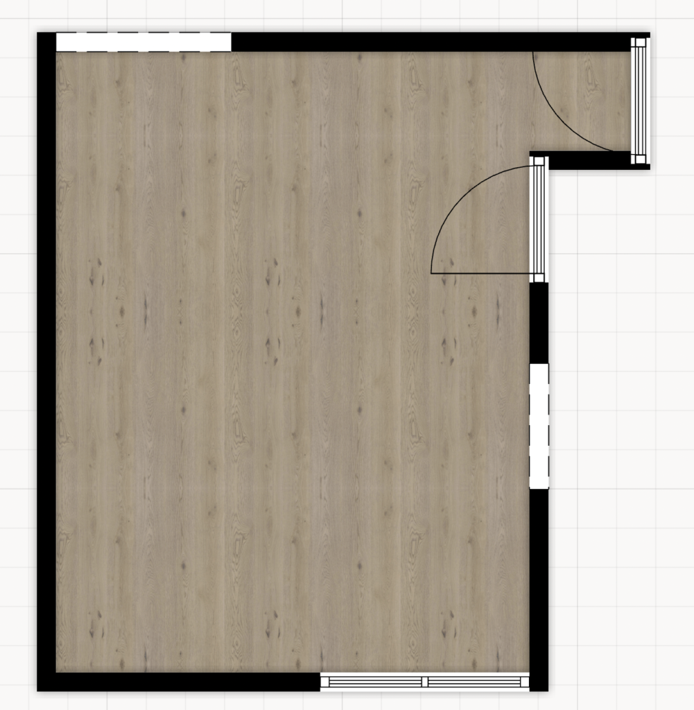
Overall, the big problem is space. Overall, it’s about a 10′ x 15′ space for the shared living room and dining room. So from the beginning, that relatively narrow, tiny space made things a little more difficult for me. Here’s a look at the floor plan to give you an idea. (They definitely mislead with the overall room width of “11 feet” when the only part of the room that was 11′ wide was the doorway. But anywayyy)


Another major pain point is the fact that there is no separate dining room. As someone who eats almost every meal at my dining table, not having one wasn’t an option. Especially since there’s not even a bar area to put stools and eat. This is important for my day-to-day life, but also as a place to lay out food when I have guests over. So one of my priorities was trying to fit a (very) small dining table in this space.
The next two aren’t so much of a space problem as much as they are me being stubborn and refusing to budget problem. But I already choose my dream couch to splurge on (see my post on why I don’t regret it) and it was pretty big for the space. About 96 inches wide with a chaise length of 65 inches. And I wasn’t changing that, so we had to work around it.
Plus I’m a big TV hater. I’ve always thought they were the ugliest eyesore, and I’m glad people are finally waking up to it. So, needless to say, we’re a projector household. And while we absolutely love our projector that is basically move theater quality, it’s a little finicky about where you have to place it, so that was a large consideration.
Another problem that affected my design decisions in the whole house: not a ton of storage.
The solutions I came up with
Like I said, I was not going to miss out on getting my dream Floyd sectional, goddamnit. So in order to make that work, I had to think creatively about how to make it easier to navigate the room around it, and how to visually reduce the clutter since it takes up a lot of visual space.
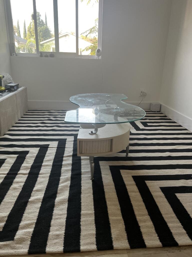
And the godsend: this $40 coffee table on Craigslist
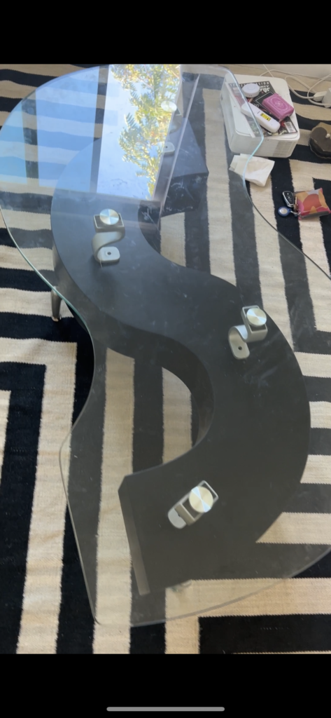

The benefits are threefold:
- The curved, irregular shape makes the flow around the room much smoother since you don’t have to navigate around harsh edges.
- The glass tabletop helps to reduce the visual weight of the table, making the room look a lot less cluttered.
- It has built-in, hidden sliding doors. While they’re pretty small, they do allow for a small amount of much-needed storage.
I decided to paint the table with cream, stone-textured spray paint as well. So that further helps it visually descend a little into the floor while still making it interesting and aid my goal of having lots of natural elements in the room.

Next: the perfect-sized dining table
This idea of a beautiful but small green marble dining table sparked when I saw a large side table on Facebook Marketplace. It was gorgeous. It was the perfect size. The perfect height. It was the perfect shape. I reach out immediately only to receive no reply and later see that it was sold 🙁
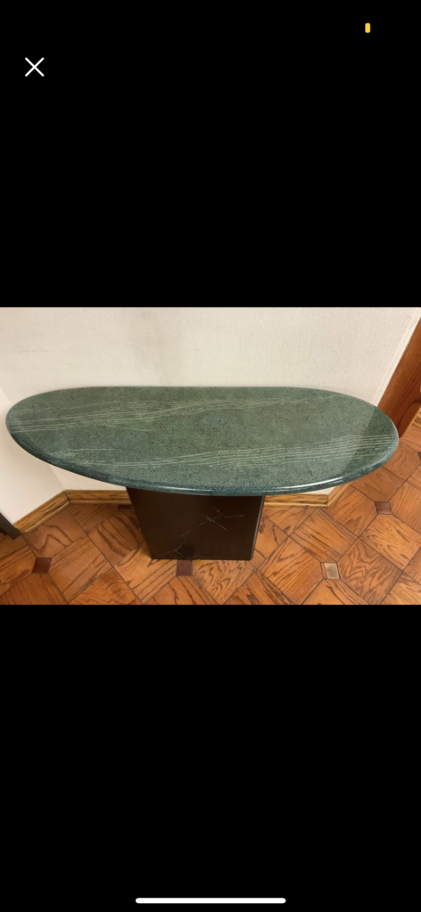

A moment of silence for the table, please.
However, it made me realize that a green marble table is exactly what I needed to bring my dream green small living room to life. So the search began, and I eventually found a 18″ x 38″ marble slab. And this happened to be exactly within my range for the size dining table I could fit. (Super small, I know. But I didn’t want to sacrifice flow and knew I could make this size work). And the best part, it was $30.
I found a really sturdy, $20 table base on Facebook Marketplace as well and some construction adhesive and there we had my perfect dining table for less than $60 for materials and supplies!
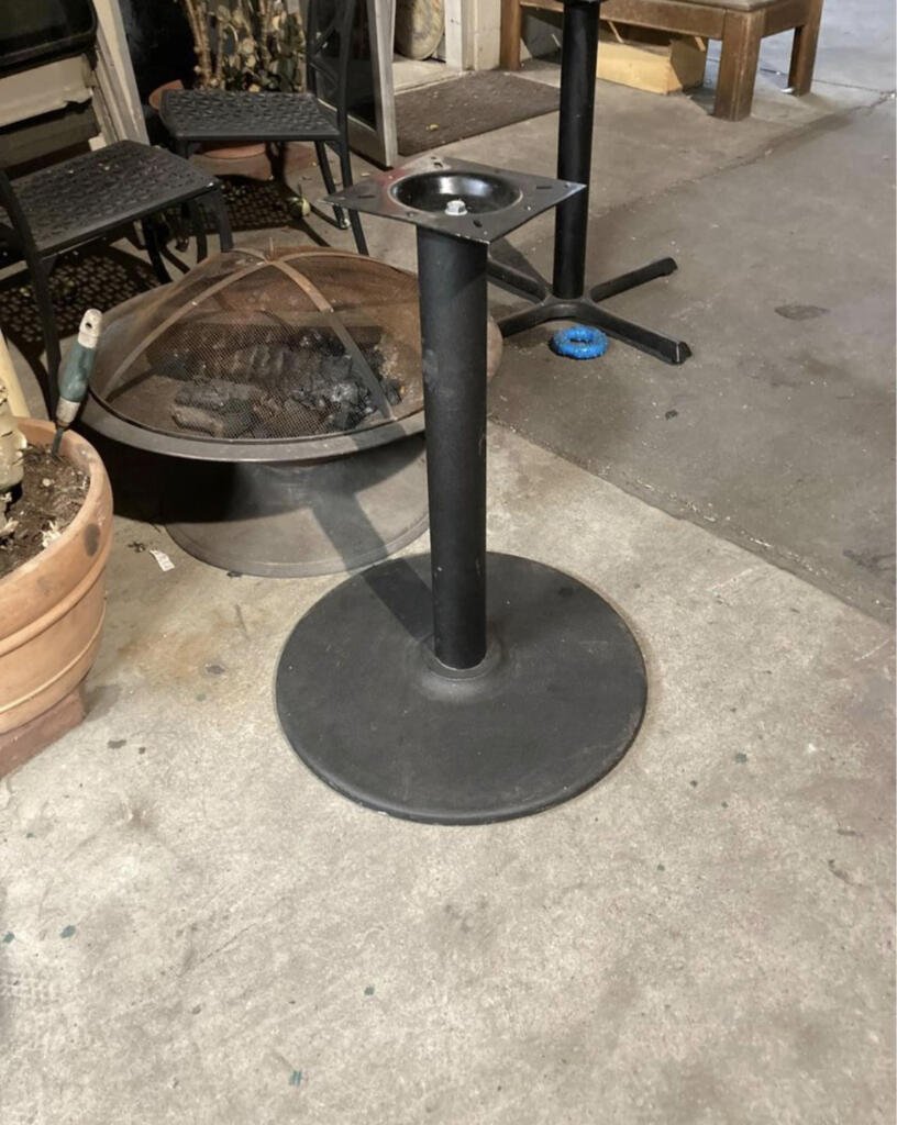

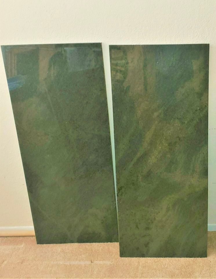

I will say, I am really bummed I couldn’t get an organic-shaped piece of marble like the one that got away so that it could match the vibe of my coffee table. But you win some, you lose some. I may look into getting it cut later.
My skinny mini sideboard
I’m a big sideboard girly. I think they add such an element of sophistication. Not to mention some much-needed storage in the space.
The main problem though: because of my large couch with a chaise, I couldn’t do anything too wide. Even 12 inches was pushing it honestly. But I wanted to get something of a statement to either add a pop of fun color or some natural material. So I honestly expected it to take a while to nail down the perfect thing.
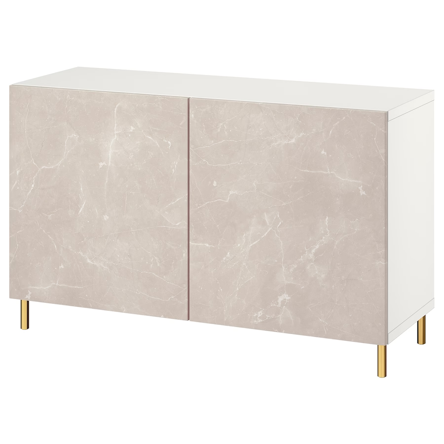
And then I was at Ikea. I was never planning on getting any large pieces of furniture from Ikea, only accessories. But then I saw this beautiful floating sideboard (the BESTA unit) with a really stunning faux stone pattern on the doors, and I was sold. And the most incredible part: it was only about 8 inches deep and a few inches shy of the total length of the wall I had to work with. It’s like it was meant to be.
So while it’s a little narrow for any substantial storage, I can easily store some games, candles, books and other small accessories in there.

Not ideal, but it works: the projector setup
I knew some compromises would have to be made, and I had a feeling it would be with the projector. Since it really can’t be further than 3 feet from the wall without the projection being massive, we have to get a small table (an excuse to get a cute lil drink table I’ve always wanted??) and move the projector to there when we need it.
We are hanging a pull-down projector screen covering the bedroom door and wall to the left of it. But it can be retracted into its case on the ceiling when not in use. So the projector will have a slightly inconvenient yet usually invisible presence in the living room.
Building my floor plan in Floorplanner
I mentioned in my best digital tools for design post how much I love to use Floorplanner to lay out my rooms before I actually start purchasing and placing furniture. It’s a great way to see realistically how much you can comfortably fit in a room and what the optimal layout is.
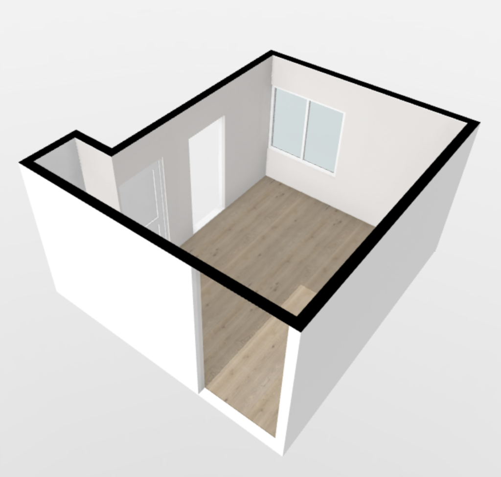
So I started by building out a skeleton of the room to see what I had to work with.


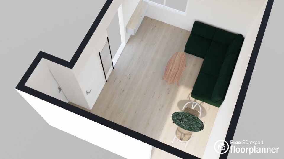
So then I began planning some things out. At this point in the planning process, I picked out my couch and had the dining table, but only the ideas of the sideboard/dining table were in existence. So I mocked it up with a general size/shape I was hoping to find.
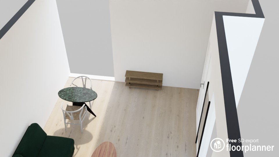
One criticism I do have of Floorplanner though is their very limited selection of furniture. And you’ll see the result of that in my frankenstein’d couch which is actually just two couches placed on top of each other. So this is better for just visualizing how things will fit together and not the actual look of the end result.
But this is what I ended up with, of course excluding a rug to frame out the living area from the dining area and a complete lack of accessories:


And the 3D view of both sides:


Let’s make it look real with Procreate
Another one of my favorite digital design tools in action! Like I said, Floorplanner is great for visualizing how a floor plan will flow. But once you actually have exact furniture items and accessories picked out, Procreate is my favorite place to wrap up project planning.
It takes a little finesse and a lot of patience, but you end up with a pretty realistic vision of what the real life room is going to look like.
This is where I can really have some fun and place some accessories.
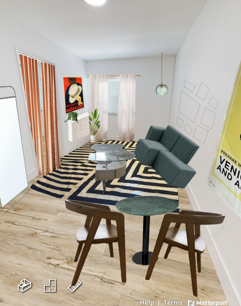

Some features:
- I have these two great art pieces already – the vintage hat advertisement above the sideboard and the 2005 vintage art fair poster.
- I don’t know exactly what art I want in the gallery wall above the couch – it will likely be a mix of things from my current collection and new pieces – but I wanted to slate out a general layout.
- The peach curtain filling the bedroom door is one of the idea I’m most excited to see come to life. It seems both a lot more luxurious and homier than leaving the door on its hinges.
This planning was done a few weeks ago, so a few pieces are in the actual space now. But I’m going to wait until it’s all perfect to do the full reveal. But here’s a lil sneak peek from the bedroom doorway for now:


Want to stay up-to-date on the completed small living room design project and see the full design process of the rest of the apartment? Subscribe below!




Leave a Comment