When we design for disabilities, we are not just increasing access for the disabled, we are creating better design for all.
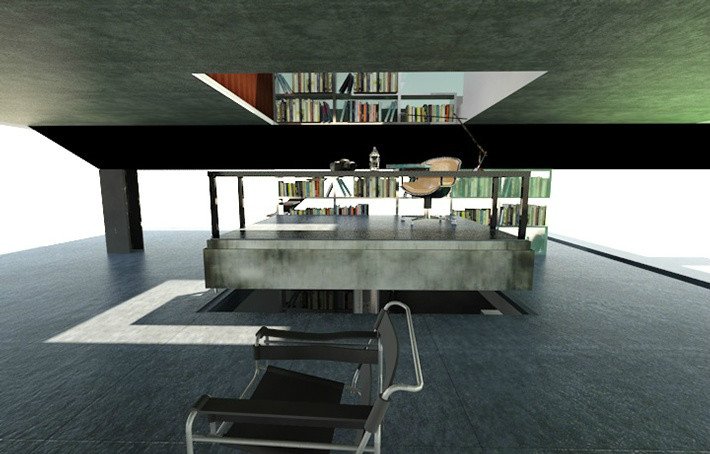

Designing for disabilities: accessible design for all
I picked up a random book at Goodwill a few months ago called No Pity: People with Disabilities Forging a New Civil Rights Movement. I grabbed it because it was cheap and it seemed interesting enough. What I realized when I started reading it is how oblivious I had been to the whole disability’s rights movement. Of course, the main topic of the book is legal rights. Mostly, this is discrimination in the workplace and the education system. But what also struck me as interesting was designing for disabilities. I didn’t realize the difference design could make in the everyday lives of physically disabled people. Usually in a negative way.
Unless a house, building, center, you name it, is designed for disabilities, there are usually tons of barriers that disabled people face upon entering. There might be a handicap entrance ramp, as it’s required in most (but not all) businesses. But people with a variety of physical disabilities can hit several other points of conflict. Such as hallways that are too narrow, no brail on signs, or even just the designation of handicap access in far away and sketchy areas of the building.
inclusive commerical design
Commercial design is what really caught my eye. We can’t force everyone to make their homes handicap-accessible (although if you’re building from scratch, why not?), but it should be a major consideration in all commercial design. It’s not right to isolate a major part of our population just because it’s not convenient to consider their accessibility.
I always talk about accessible design on this blog in terms of financial access. But it’s time to talk about accessibility in this way, too.
designing for disabilities is designing for all
In a TED talk that I watched, given by Elise Roy, a disability rights lawyer and design thinker, she mentioned the idea that by default, we should be “designing for disability first.” Rather than having to play catchup later. This is necessary to create spaces that disabled people feel included and valued in. But also, what’s necessary for disabled people can also be convenient for able-bodied people.
Think of smart technology and motion sensors. A clear benefit to all people, disability or not.
Unfortunately, when we think of disability-accessible design, most people think of hospitals, retirement homes, and other sterile, boring and lifeless design. For one, the effect of interior design on mental health should never be underestimated, but accessible design can be also visually incredible design.


I’m a huge Frank Llyod Wright fan, so I was really excited when I came across the Laurent House. This was a project that Wright was commissioned to design specifically for a disabled client. It just goes to prove that accommodations for someone in a wheelchair don’t have to be so depressing. Instead, it is a streamlined house with lots of room to navigate and a beautiful open floor plan.
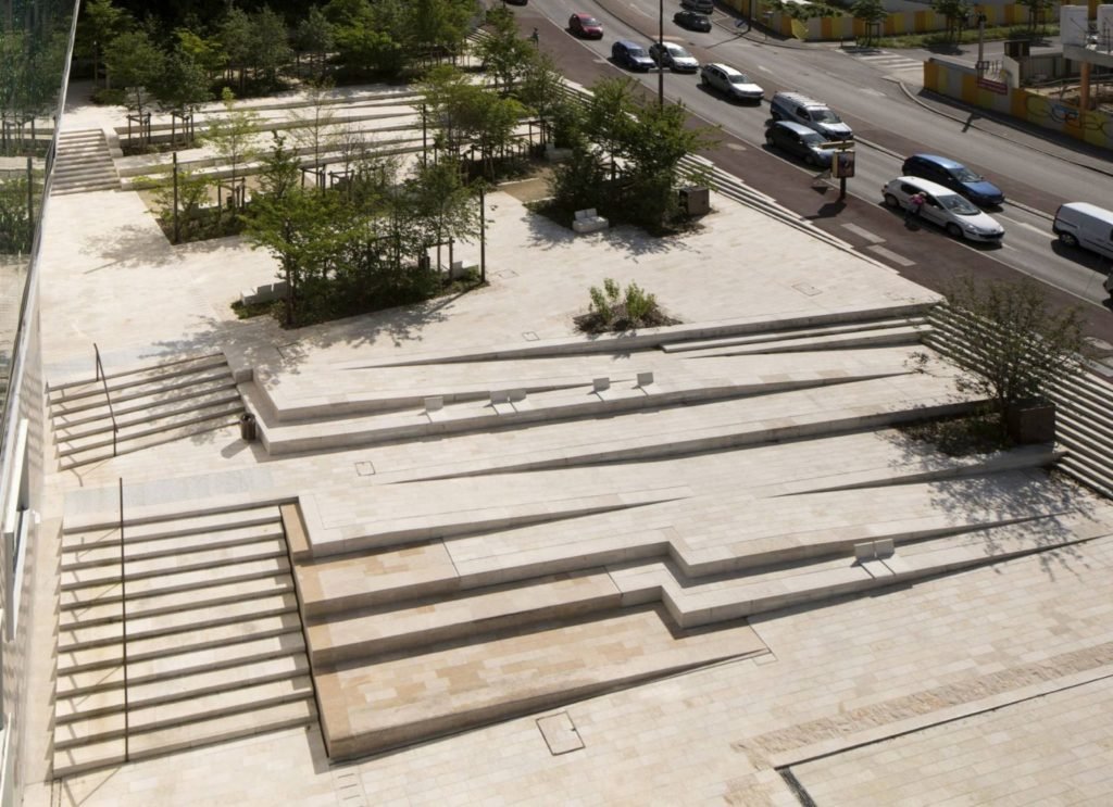
If you look out there, there are countless examples of ways that designers and architects have taken accessible design and made it into art.

honoring the friction of disability
Liz Jackson, a designer known as The Girl with the Purple Cane, stresses the importance of disabled people have options for fun, stylish things, the same as everyone else. Not just in interior design but in all design. A lot of times, when products are made specifically for disabled people, they’re boring and clinical. Or campaigns targeted at disabled customers can get caught up in the good intentions and forget about the actual design.
One quote from her that really stuck out to me was, “for me, it’s really about honoring the friction of disability. Really thinking about what sort of creative opportunity disability has to bring to design. And really about actually incorporating design into disability.”
designing for disabilities as opportunity
Just as I mentioned from the TED talk earlier, designing for disability shouldn’t be a chore, or a box to check. It’s a true opportunity to think outside of the box. It’s a chance to make things more beautiful, interesting, or simple, for everyone.
All of this is an amazing side effect of a world where disabled people don’t feel like their consideration is a hassle. Or an afterthought. They feel included and valued. If we design for disability first, we design for everyone.
shout out
Before I close out this post, I want to highlight one incredible blog that’s all about designing for disabilities. It’s called Wheel Chic Home. The blogger herself is physically disabled, so she gives lots of tips for both creating designs for disabled people, as well as designing as a disabled person. Definitely go check her out!
keep it inclusive, and
keep it homey, homies
About me
Hey my name’s Hannah Michelle Lambert, the voice behind homey homies. I’m an LA-based designer, writer, and content strategist. I’m passionate about the intersection of productivity and creativity. I love talking about creative habits, technology, processes, and everything in between that helps me blend the Type A and Type B parts of my brain.



Leave a Comment